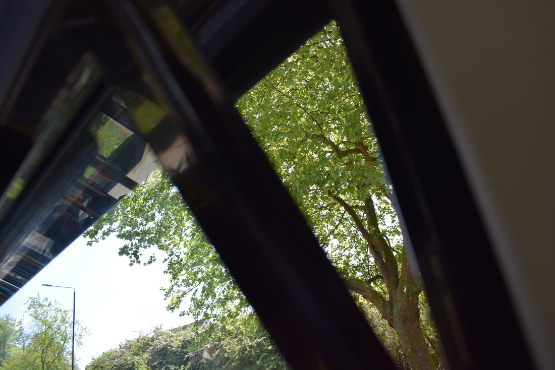
Openings.
I chose to do openings because the images are very interesting, and some of them aren't particularly what you would think of when you think of openings or something being open. Some words that I associate with 'openings' are; aperture, viewfinder, cut, crevice, door, mouth, window, hatch, space.
(I got these images from pinterest.)
|
'Dear Stranger' 1998-2000.
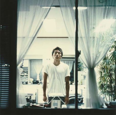
'Dear Stranger' essay. In this photograph I see a man standing in either a kitchen, office or dining room. In the corner of the room, I can also see a plant. It looks as though the image was taken from outside the window looking into the building. It's odd that the photographer is taking a photograph of a stranger in the middle of the night and the subject is allowing him to take his picture. The title suggests another opening because 'Dear Stranger' sounds like the opening of a letter. Also, the window is open so it is like the stranger is opening their home to the photographer. I think this images is relatively naturalistic because you can immediately tell what it is when you look at it. Every image has abstract elements because the world doesn't have edges, but photographs do, and in real life, the subject is 3D, but in the image he is 2D. This image is different from real life because it has a very strong contrast between the light inside and the dark night outside.Also, the image is very intricately thought out because the photographer has thought about exactly where to put the camera, and how to actually have the subject directly in the centre of the image, and how the lines of the window are parallel with the edge of the photograph. The fact that the lines in the image are strategically put interests me because it makes the image look 'cleaner'. |
Who is Lee Friedlander?
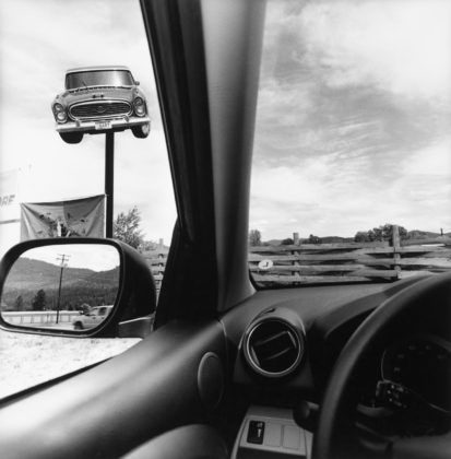
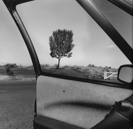
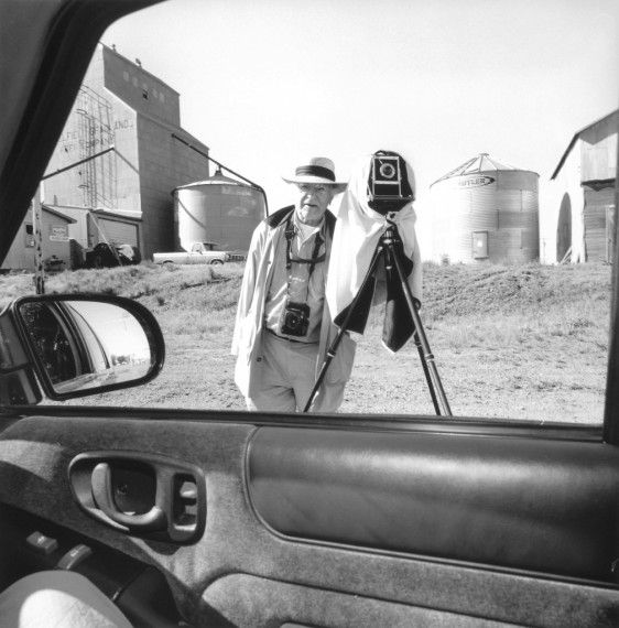
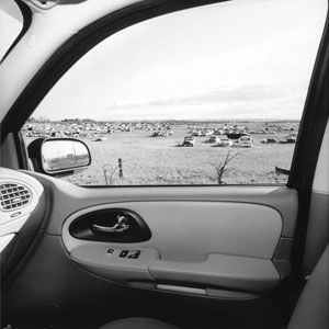
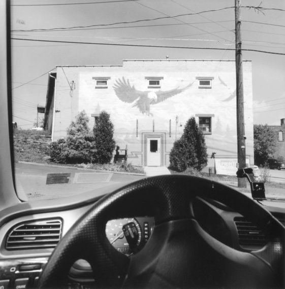
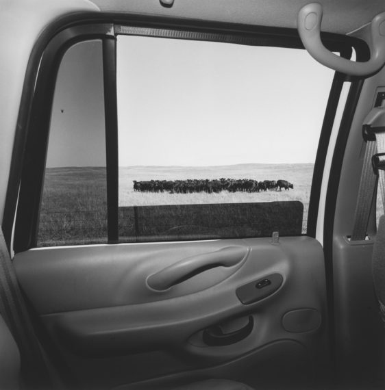
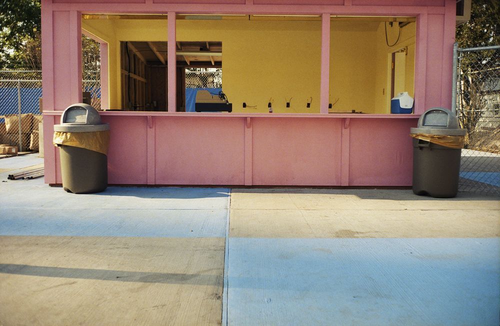
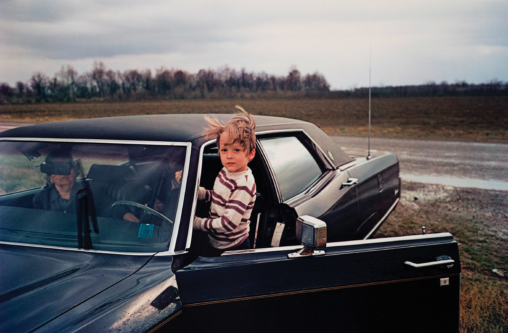
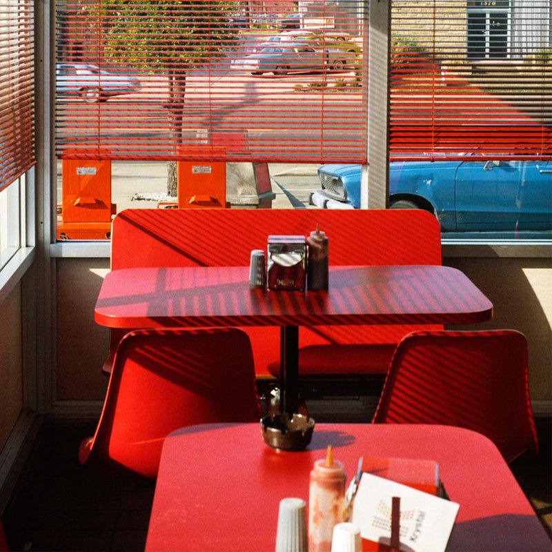
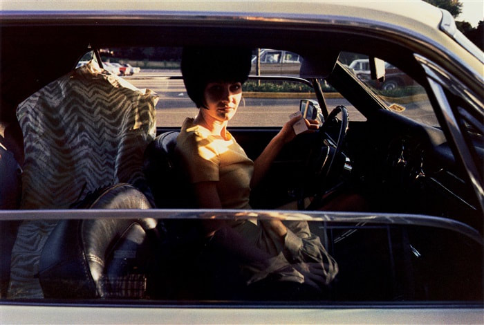
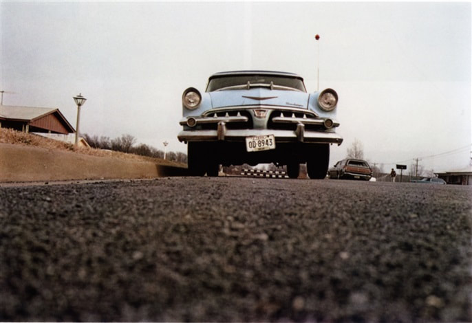
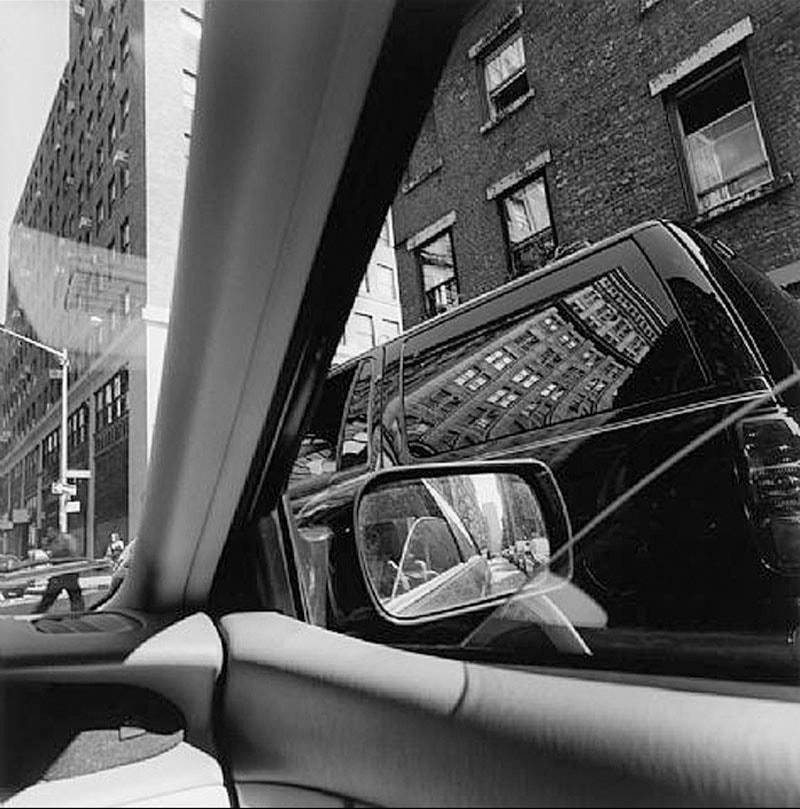
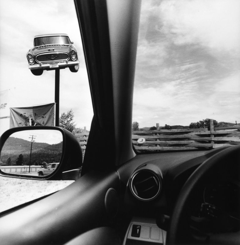
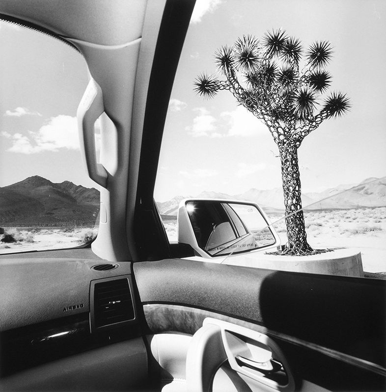
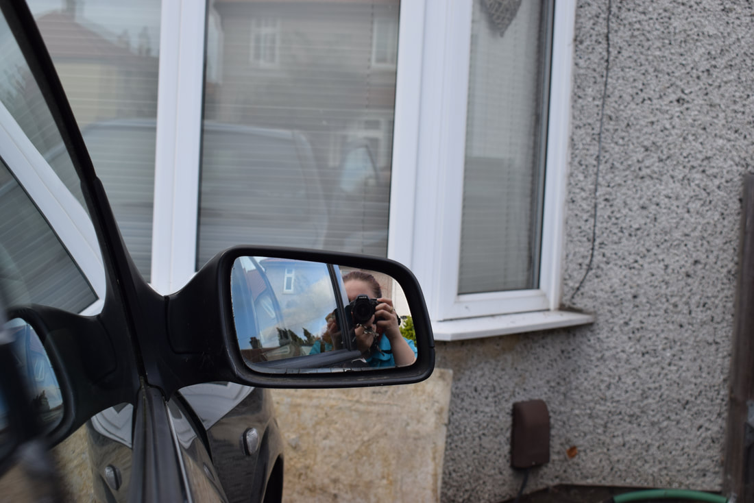
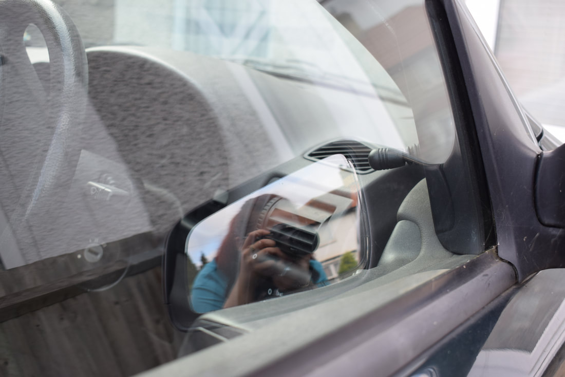
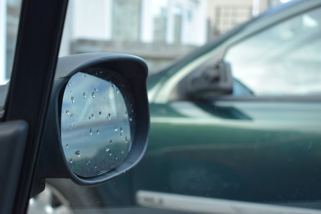
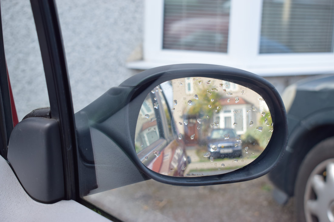
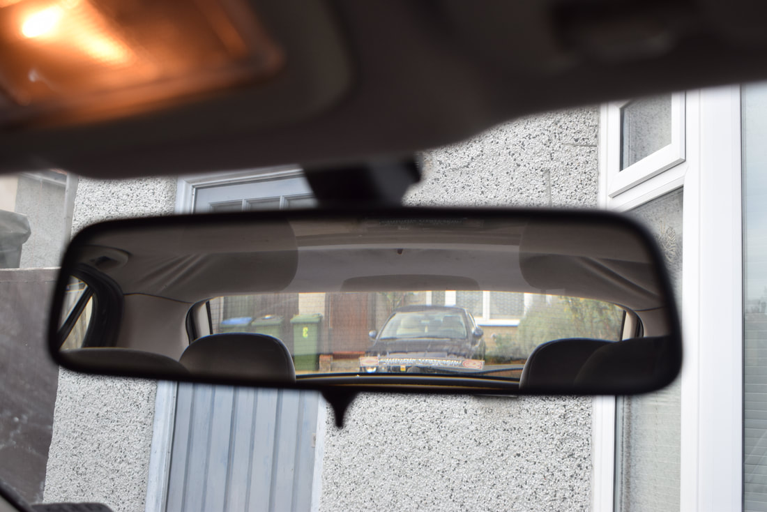
Lee Friedlander is a photographer from the U.S. In the 60s & 70s, Lee expanded an influential and sometimes imitated visual language of urban "social landscape", i.e everyday places and people. A majority of his images involve fragments of store-front reflections, structures framed by fences, posters and street signs.
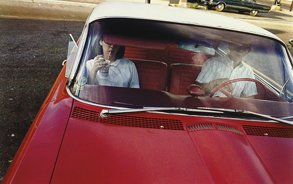
His project called "America By Car" is especially interesting to me because it has relevance to my personal project "openings", as there are many openings in a car like the windows, doors, air vents etc. I also find it interesting because it gives you an insight to what America is like in modern day, compared to how it used to be (based on his earlier images). Additionally, I like the fact that his images are in black & white because it gives the photographs a vintage feel, even though they are more recent. I think that his images being in black and white gives you a sense of continuity when comparing to his older work, as they are in black and white as well. You have to really look at the images to figure out whether the are his images from the 60s/70s or if they are from more recent years.
Lee Friedlander is a photographer from the U.S. In the 60s & 70s, Lee expanded an influential and sometimes imitated visual language of urban "social landscape", i.e everyday places and people. A majority of his images involve fragments of store-front reflections, structures framed by fences, posters and street signs.
His project called "America By Car" is especially interesting to me because it has relevance to my personal project "openings", as there are many openings in a car like the windows, doors, air vents etc. I also find it interesting because it gives you an insight to what America is like in modern day, compared to how it used to be (based on his earlier images). Additionally, I like the fact that his images are in black & white because it gives the photographs a vintage feel, even though they are more recent. I think that his images being in black and white gives you a sense of continuity when comparing to his older work, as they are in black and white as well. You have to really look at the images to figure out whether the are his images from the 60s/70s or if they are from more recent years.

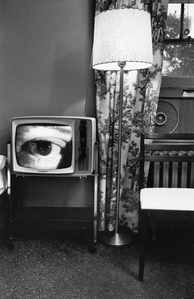

This is one of my favourite images because it looks as though there are two different images put together in photoshop. Also, I think that when images are in black & white they look more abstract because the colours don't distract you. I think that the composition of this image is very odd, but intriguing at the same time. For example, where the door and T.V are, it looks as though the image is split even though it is one image. I also like the contrast between the T.V and the black background as it stands out, considering that the television is in black & white.
HOMEWORK.
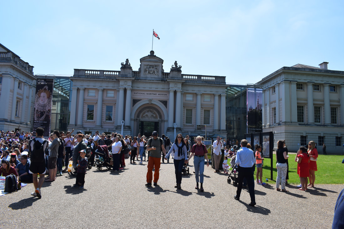
DOCUMENTING MY JOURNEY TO AN EXHIBITION.
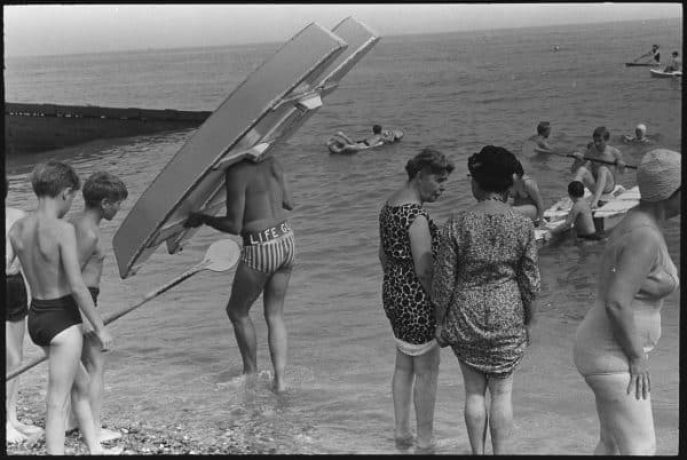
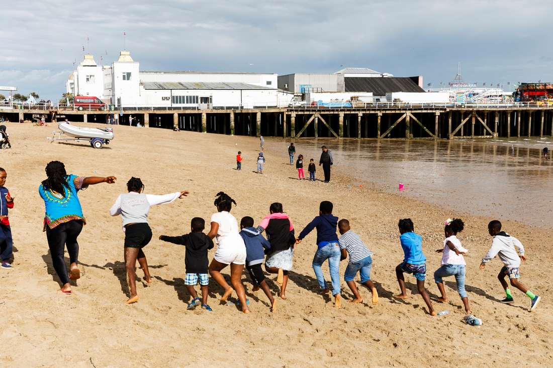
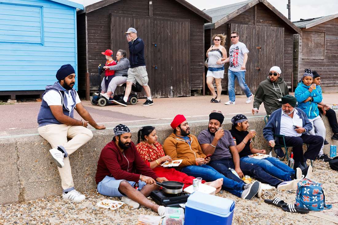
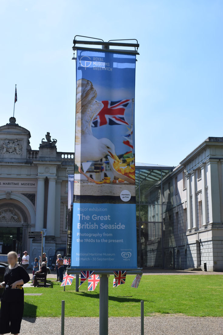
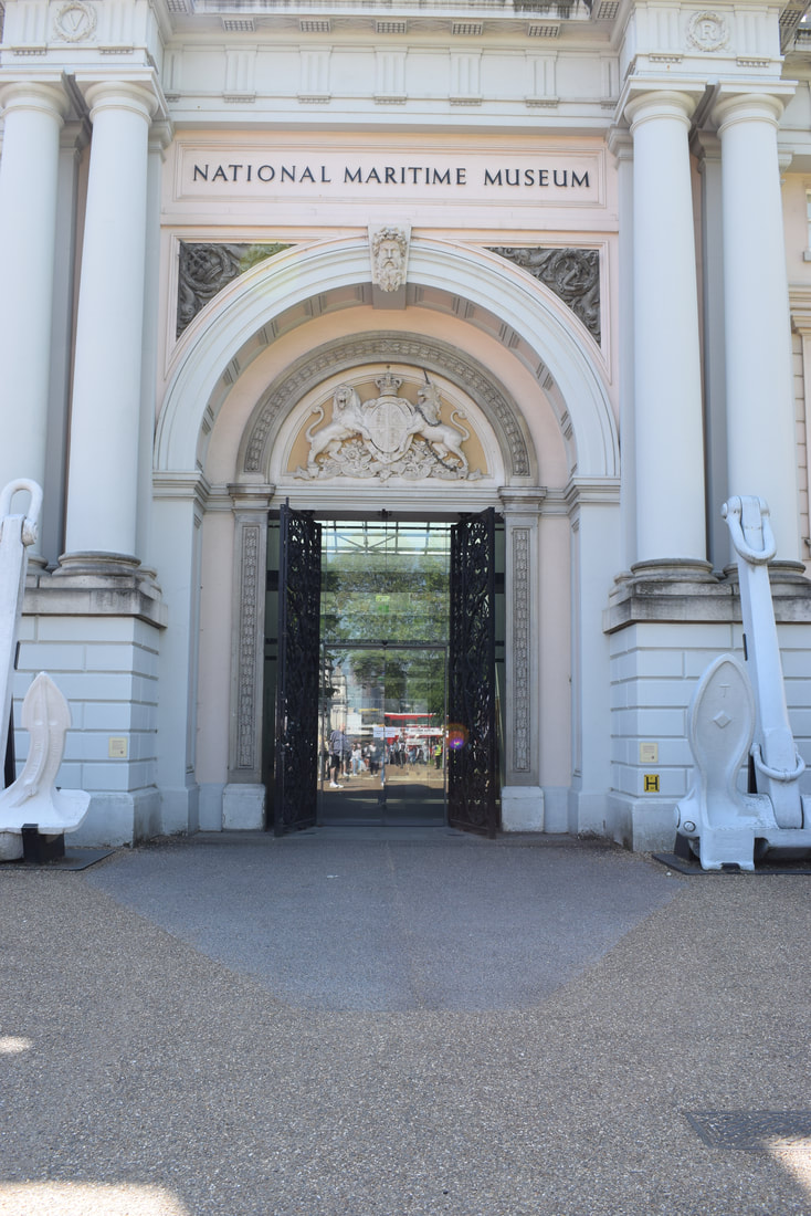
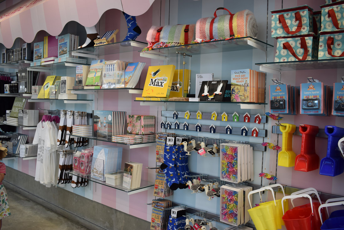
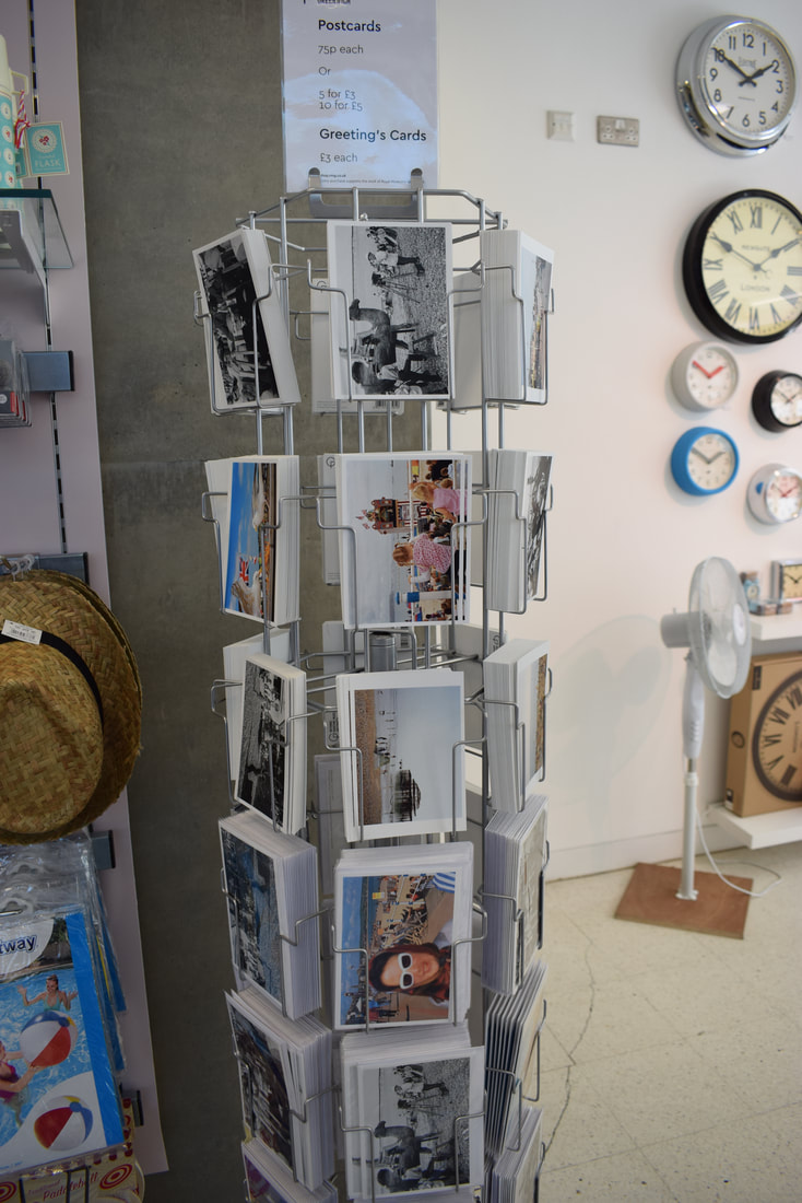
This exhibition is documenting the work of Martin Parr. He is a British photographer, photojournalist and photobook collector. The exhibition is called "The Great British Seaside". It includes images from the archive of Martin Parr, new films and new work from him as well. This exhibition intrigued me the most because it shows the diversity of todays world, and that we are all different just from some images of the seaside. I also like that it isn't all "typical" british people in these images. It is people from all walks of life that are British.
'This is the perfect exhibition to roll us into summer..’
- The Londonist
‘Spellbinding and sometimes side-splitting photography exhibition documenting how we spend leisure time at our fraying coastline.’
- The Telegraph
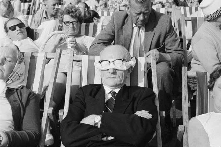
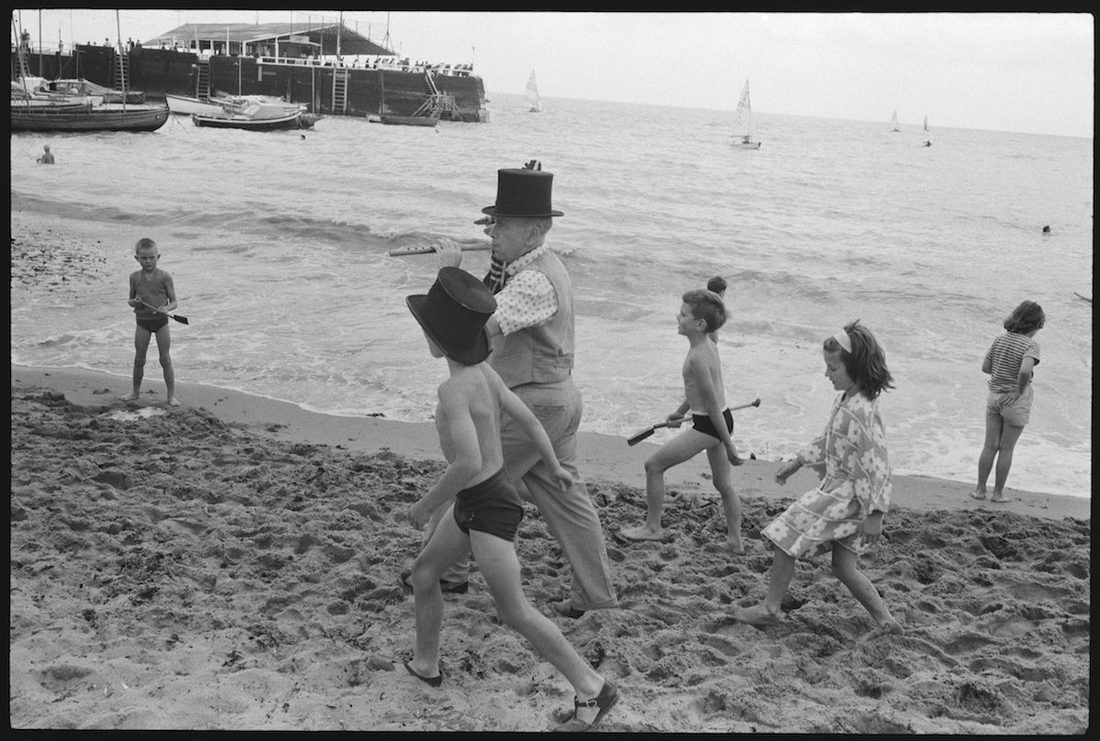
I really enjoyed going to this exhibition because it gave me an insight into what the British seaside, and people were like in the 60's, 70's & 80's, and how it has changed. For example, one of my favorite images was by Tony Ray-Jones and it was of an old man in a suit with cloth covering his eyes, and his glasses over the top (the first image below). In the background you can see other old people dressed smartly in deck chairs. This is one of my favorites because it shows that even if you were just going to the beach, people still dressed smartly, compared to now as people wear jeans, shorts, vest tops, bikinis etc. They are much less smart nowadays.
DOCUMENTING MY JOURNEY TO AN EXHIBITION.
This exhibition is documenting the work of Martin Parr. He is a British photographer, photojournalist and photobook collector. The exhibition is called "The Great British Seaside". It includes images from the archive of Martin Parr, new films and new work from him as well. This exhibition intrigued me the most because it shows the diversity of todays world, and that we are all different just from some images of the seaside. I also like that it isn't all "typical" british people in these images. It is people from all walks of life that are British.
'This is the perfect exhibition to roll us into summer..’
- The Londonist
‘Spellbinding and sometimes side-splitting photography exhibition documenting how we spend leisure time at our fraying coastline.’
- The Telegraph
I really enjoyed going to this exhibition because it gave me an insight into what the British seaside, and people were like in the 60's, 70's & 80's, and how it has changed. For example, one of my favorite images was by Tony Ray-Jones and it was of an old man in a suit with cloth covering his eyes, and his glasses over the top (the first image below). In the background you can see other old people dressed smartly in deck chairs. This is one of my favorites because it shows that even if you were just going to the beach, people still dressed smartly, compared to now as people wear jeans, shorts, vest tops, bikinis etc. They are much less smart nowadays.
William Eggleston.
Eggleston is an American photographer who is credited with increasing recognition for colour photography. He is more known for pop art, but I think that some of his images relate to the theme of openings. One thing that I find interesting about his images is the colour. The reason I find this interesting is because the colours look more cartoon like and vibrant, not like in real life.
Eggleston is an American photographer who is credited with increasing recognition for colour photography. He is more known for pop art, but I think that some of his images relate to the theme of openings. One thing that I find interesting about his images is the colour. The reason I find this interesting is because the colours look more cartoon like and vibrant, not like in real life.
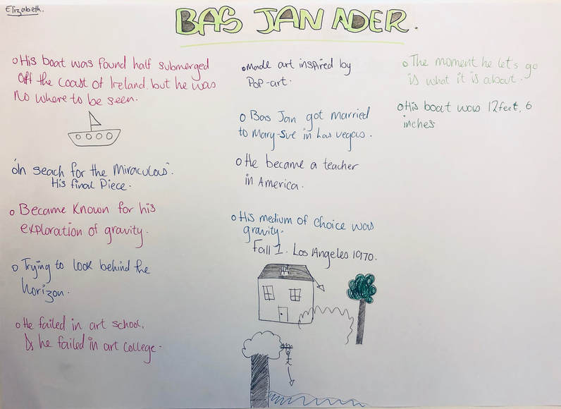
BAS JAN ADER.
He was/is a dutch artist. He sailed out to sea for a project, but no one knows where he is or if he is even alive. His boat was found off the coast of Ireland but he was no where to be seen.
He was/is a dutch artist. He sailed out to sea for a project, but no one knows where he is or if he is even alive. His boat was found off the coast of Ireland but he was no where to be seen.
- His last piece of work was called "In search of miracles."
- BasJan became well known for his exploration of gravity. One of his pieces is called "Fall 1", in which he sits on top of his house on a chair and proceeds to fall off of it.
- He travelled across the sea in a 12 foot, 6 inch boat.
- He is believed to have died around 1975, but no one is entirely sure. Some people believe that he is sill alive, while others believe that he is dead.
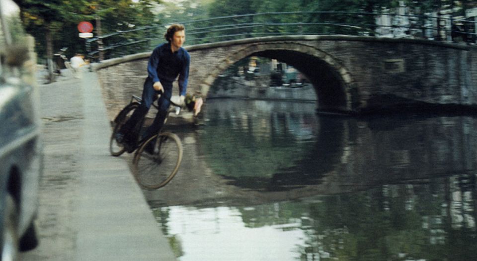
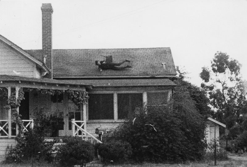
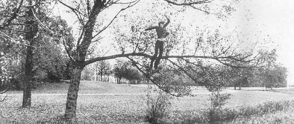
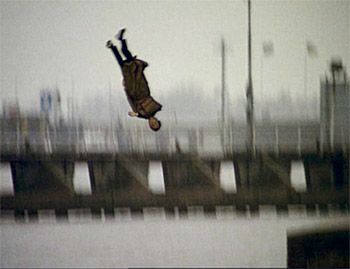
These 4 images are some examples of Bas Jan's exploration with gravity. His most famous photograph is the first one with the bike. With this image, it isn't about the moment before he goes into the water, or the moment he falls into the water. It is about the moment he lets go because of the complete control he has over his actions. This idea about the moment he lets go is relevant to all of his images that include him falling and exploring gravity, because he makes the conscious decision to let go or fall and he is the one who has all the control over what happens.
Many photographers have been inspired by Bas Jan's gravity work that they have created their own version. Some examples of photographers are; Fernando Sanchez, David Horvitz, Gavin Maitland.
Many photographers have been inspired by Bas Jan's gravity work that they have created their own version. Some examples of photographers are; Fernando Sanchez, David Horvitz, Gavin Maitland.
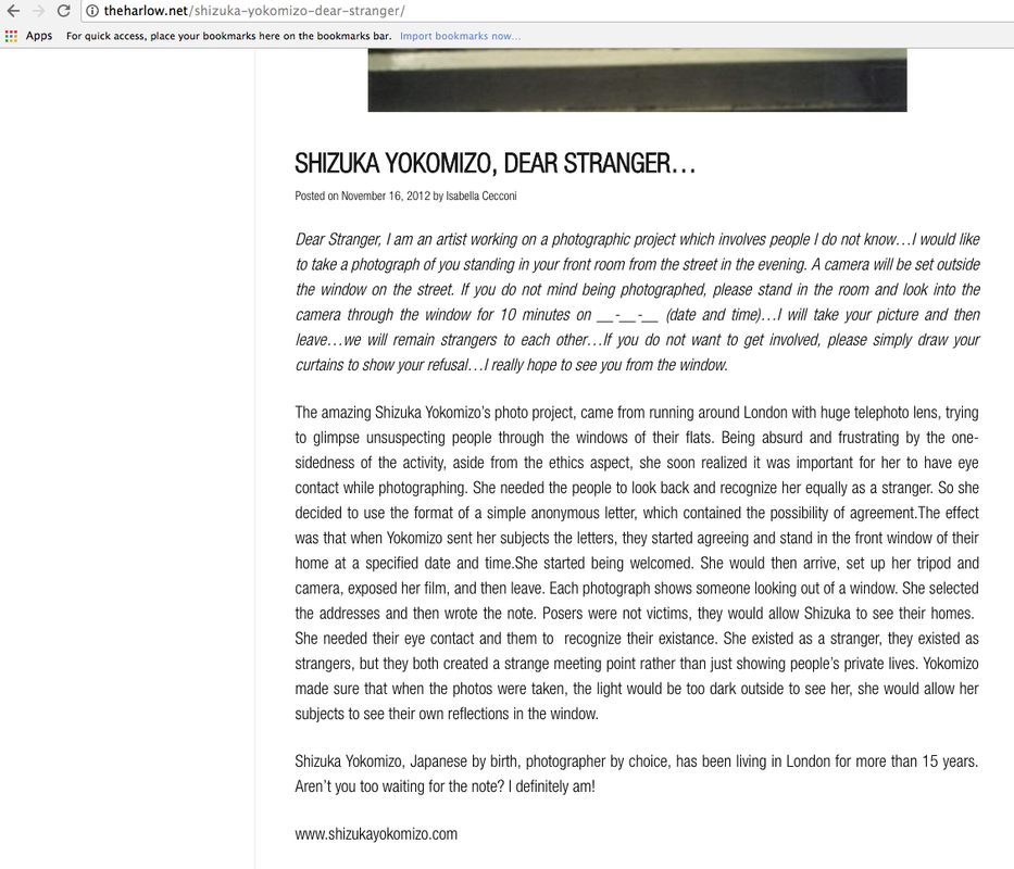
Shizuka Yokomizo.
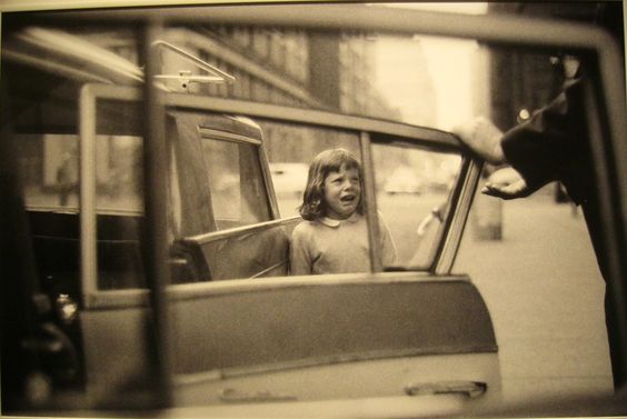
Yokomizo is a Japanese photographer who is currently based in London. She began her college career studying philosophy at Chuo University before she earned her Bachelor of fine arts in photography at London's Chelsea College or arts. She did a project called 'Dear Stranger' in which she sent letters to strangers and asked them to be in a certain place at a certain time so she could take a picture of them.
The 'Dear Stranger' project links to my project 'openings' because the window its self is a sort of opening, but it also relates to the strangers opening up and letting them into their homes (theoretically). Also, there are many other different openings in there backgrounds of the images, e.g. doors and cupboards.
Summer revision work.
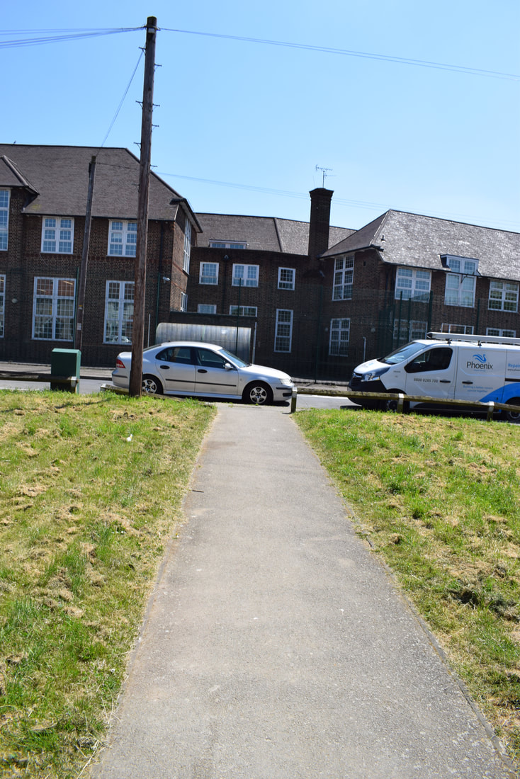
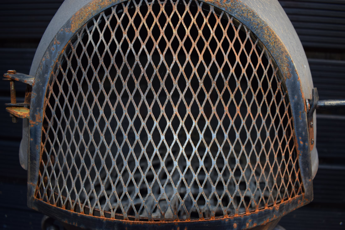
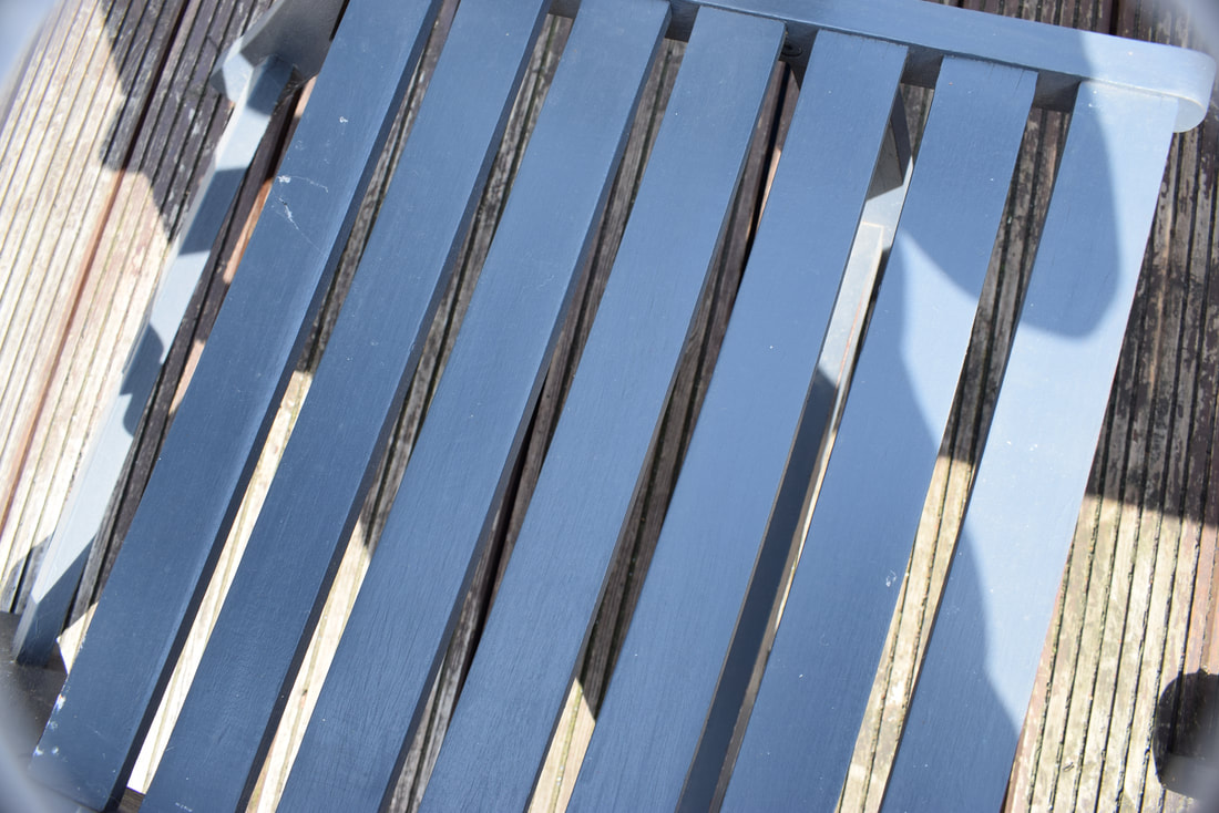
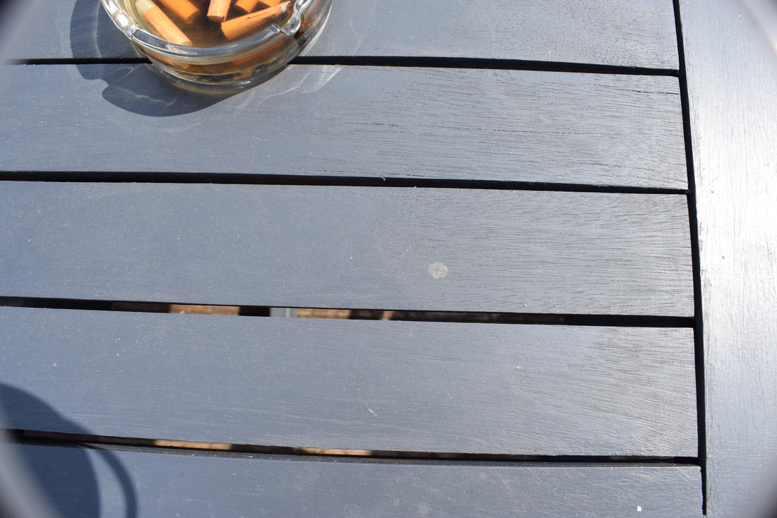
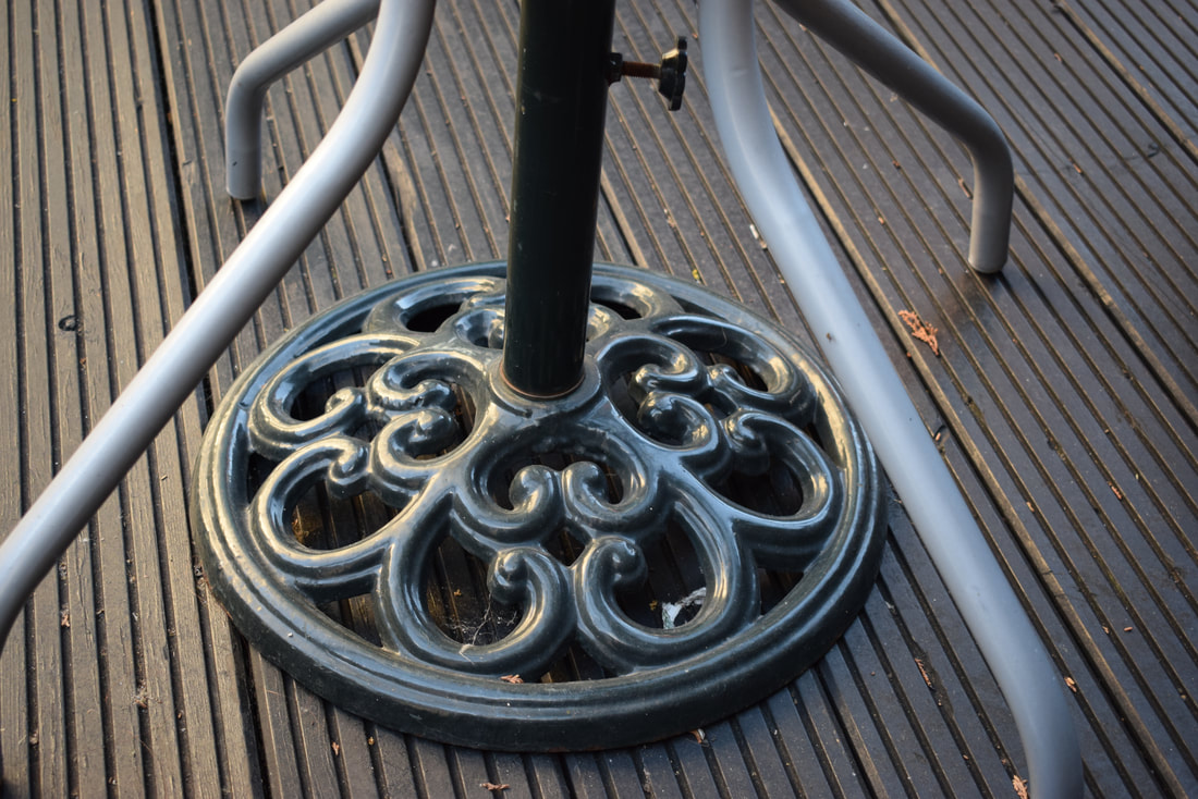
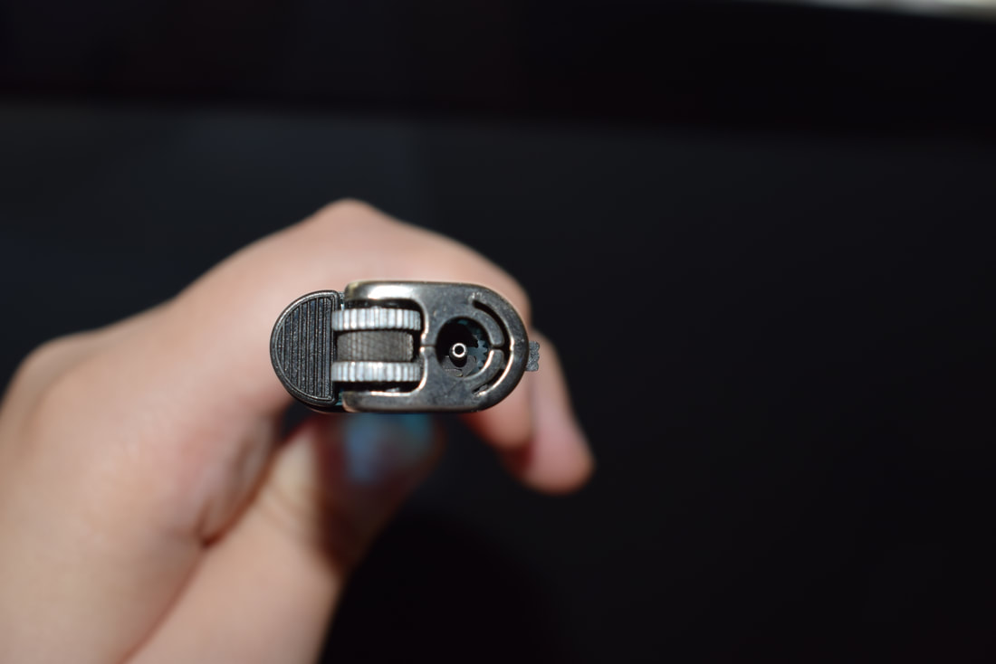
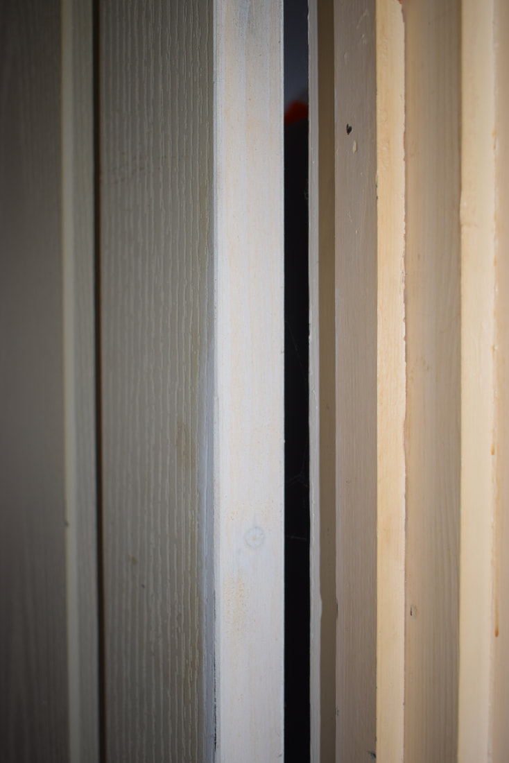
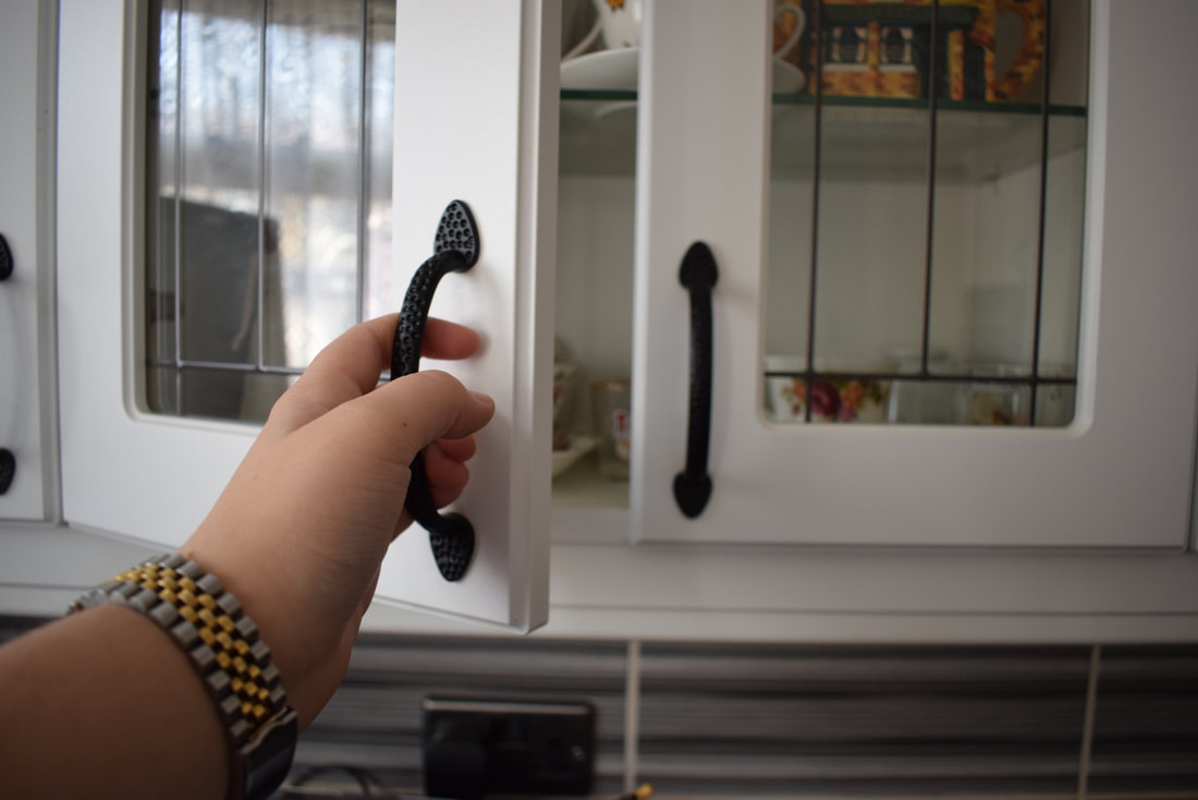
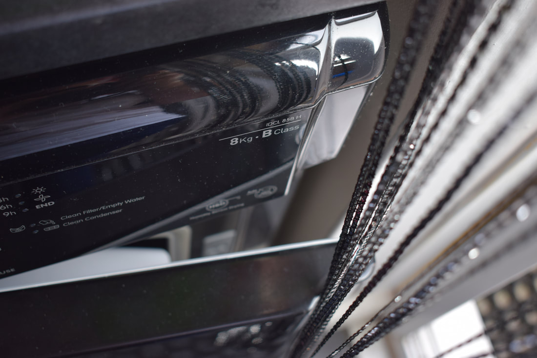
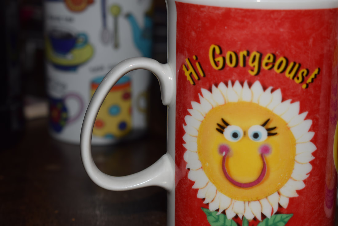
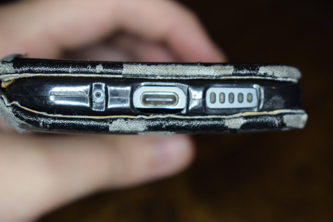
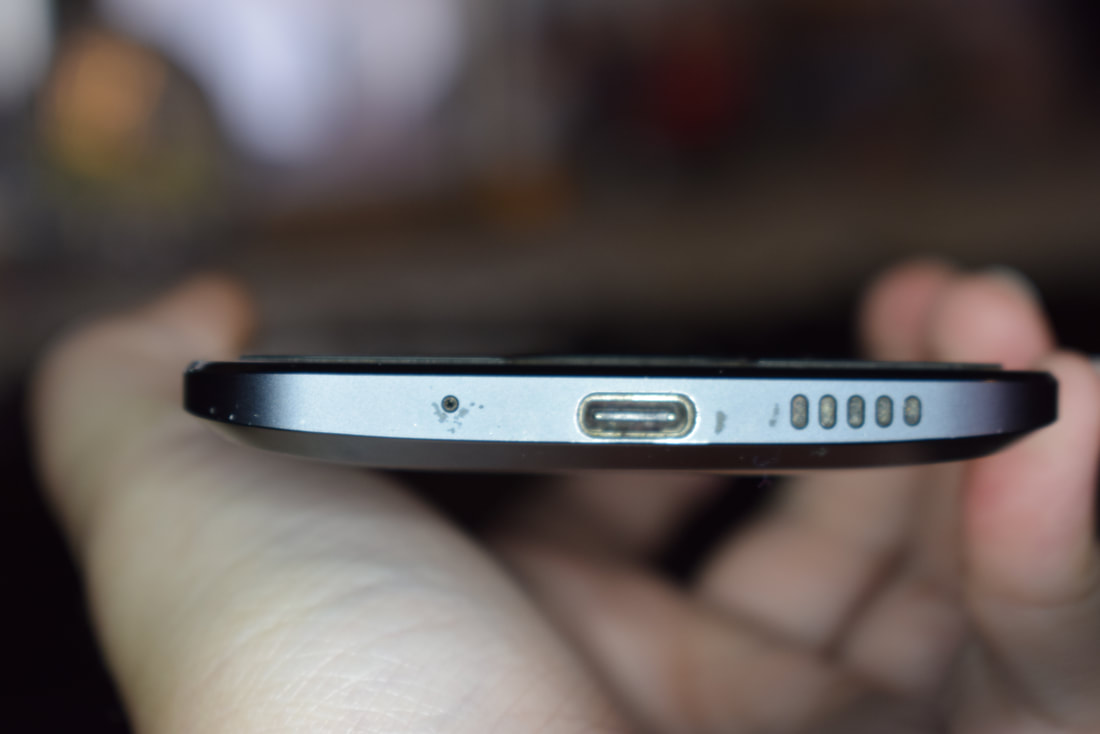
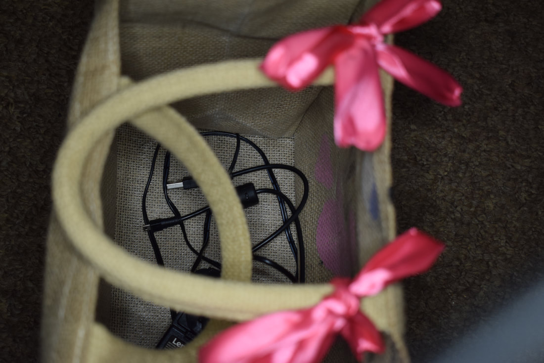
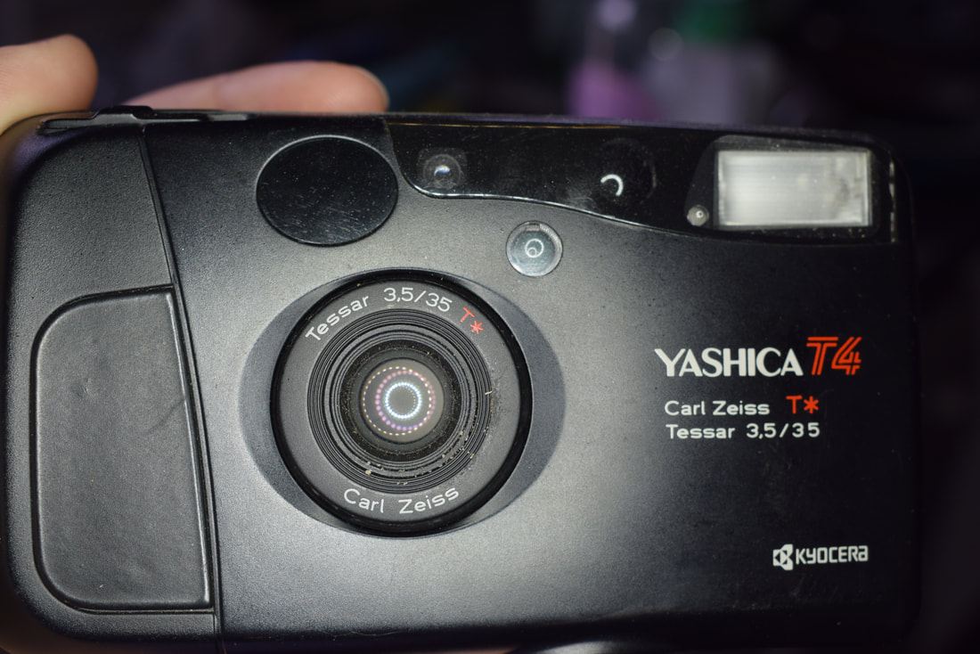
My theme for this project is openings, so I decided to focus on 3 different types of openings. The 3 I chose were facial openings, openings in the garden and household openings. I decided on these 3 types of openings because I found them the most interesting.
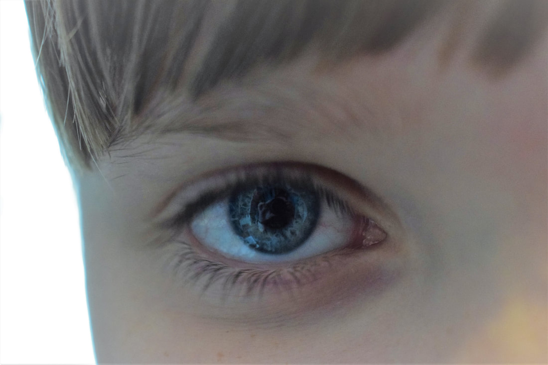
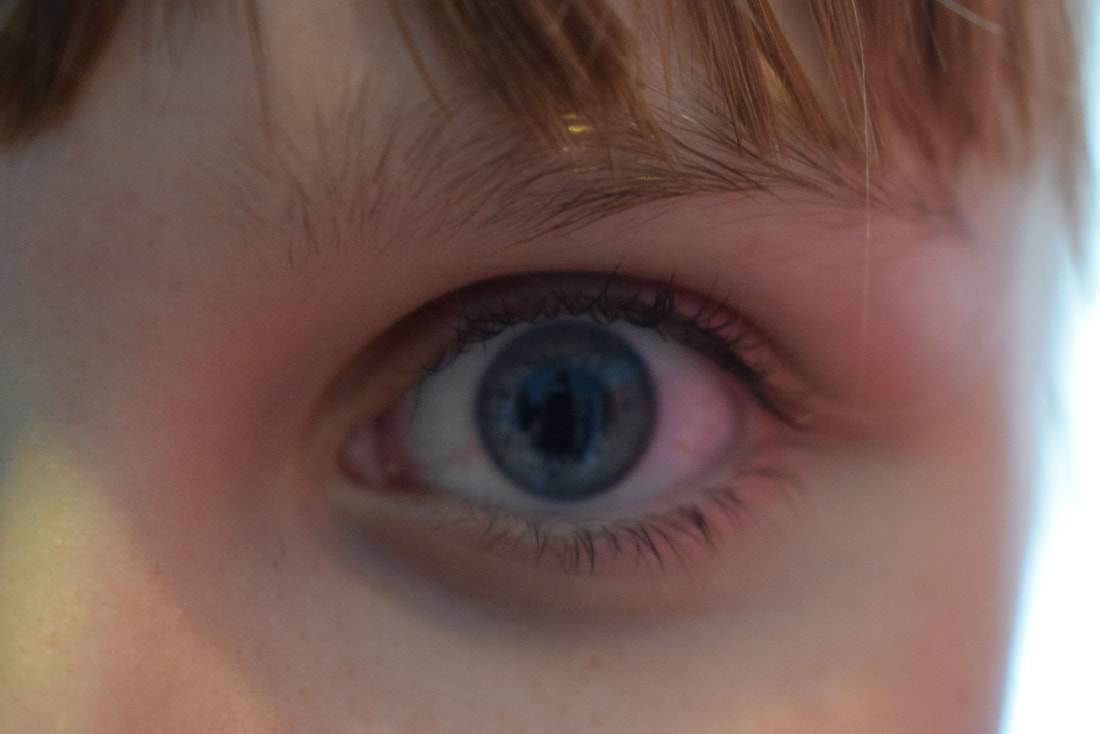
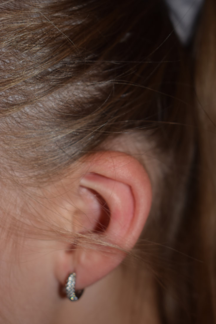
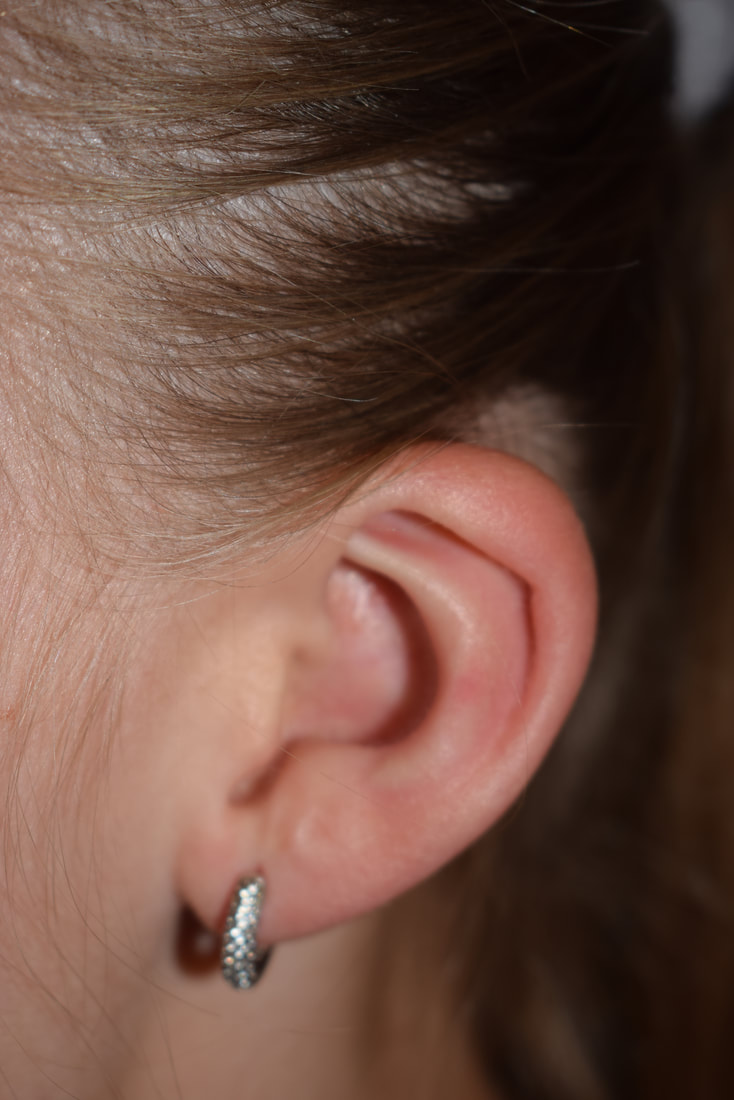
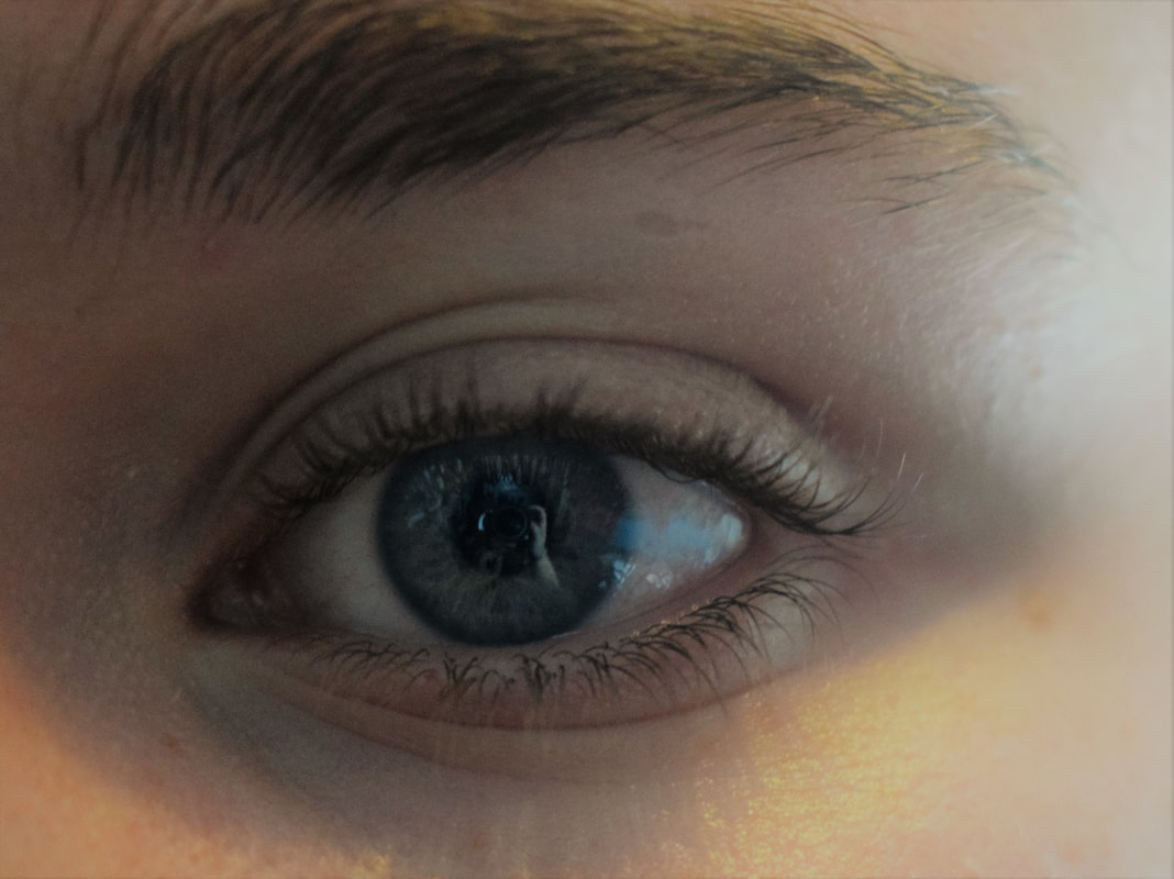
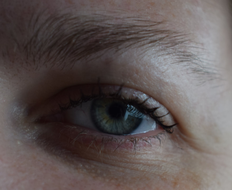
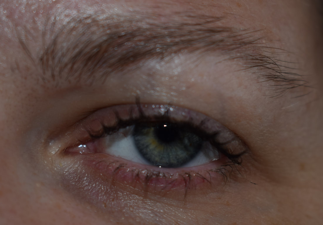
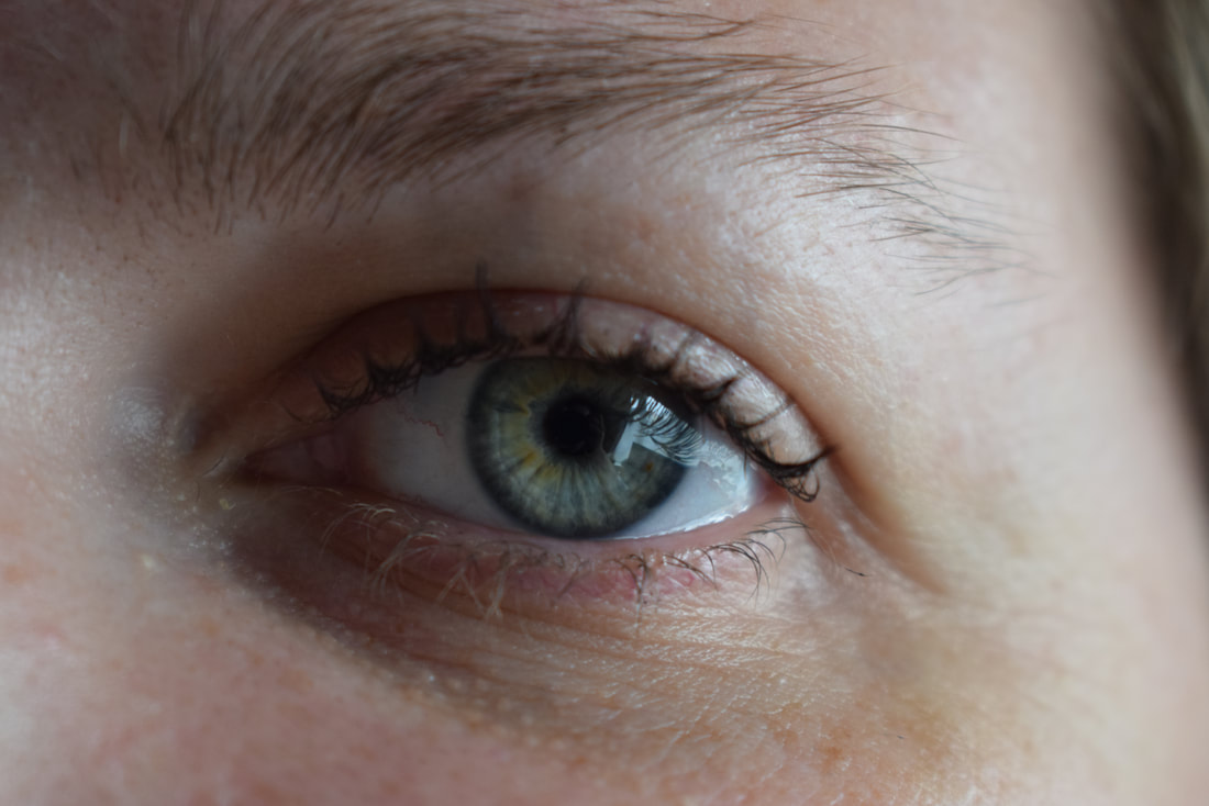
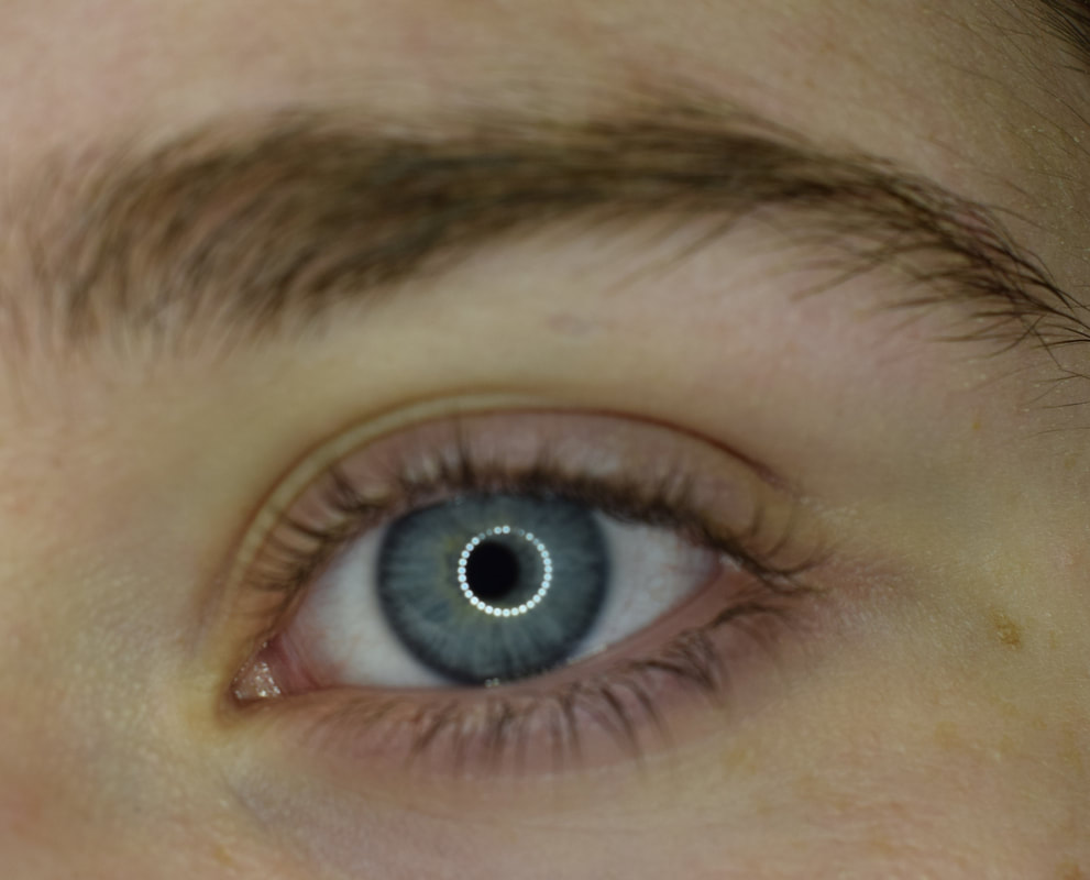
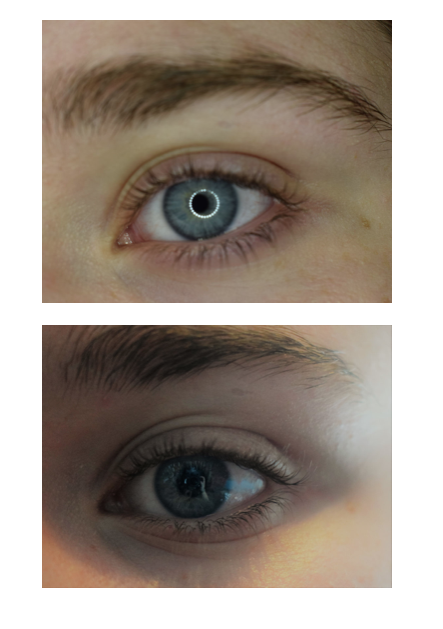
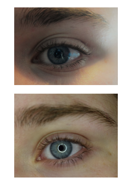
Facial Openings.
I found facial openings deeply interesting because with eyes, for example, they can tell a great deal about people, like if they are young or older and you can identify if they have witnessed good and bad things in their life.
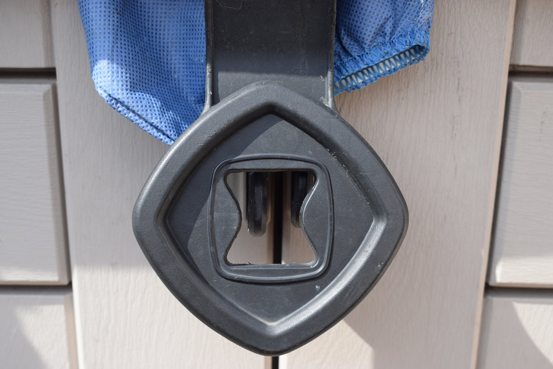
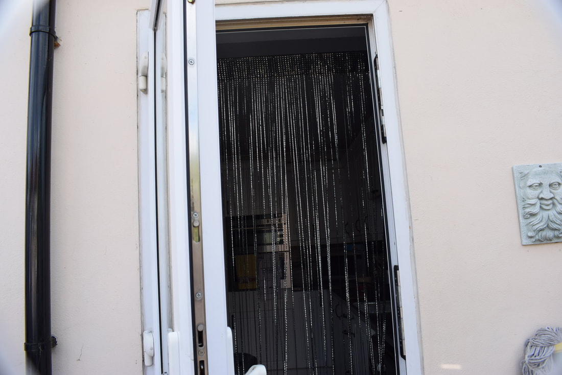
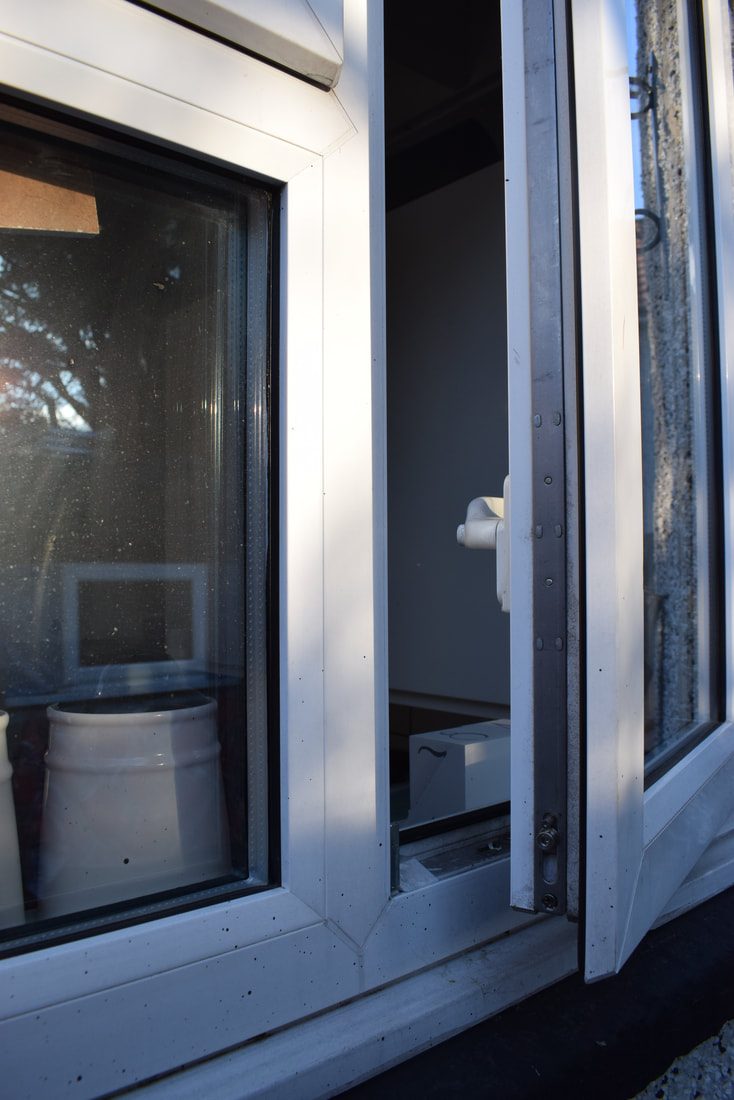
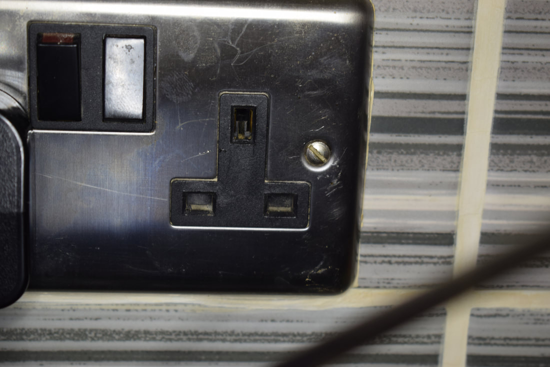
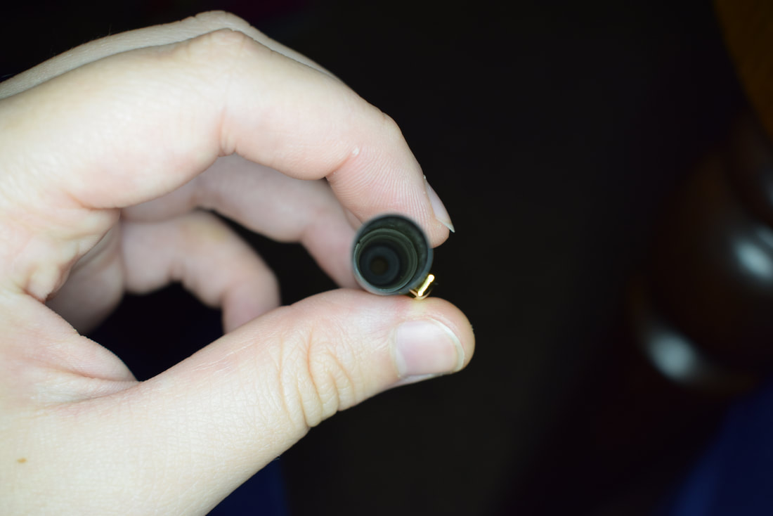
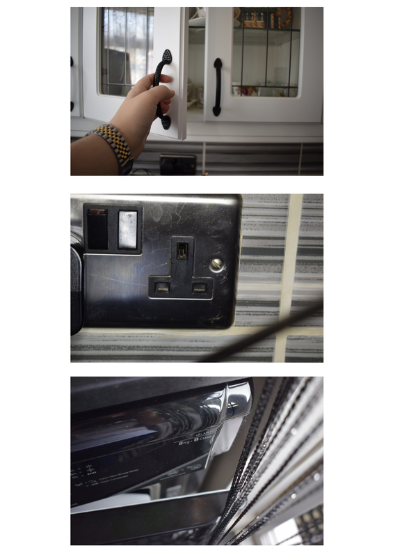
Household openings.
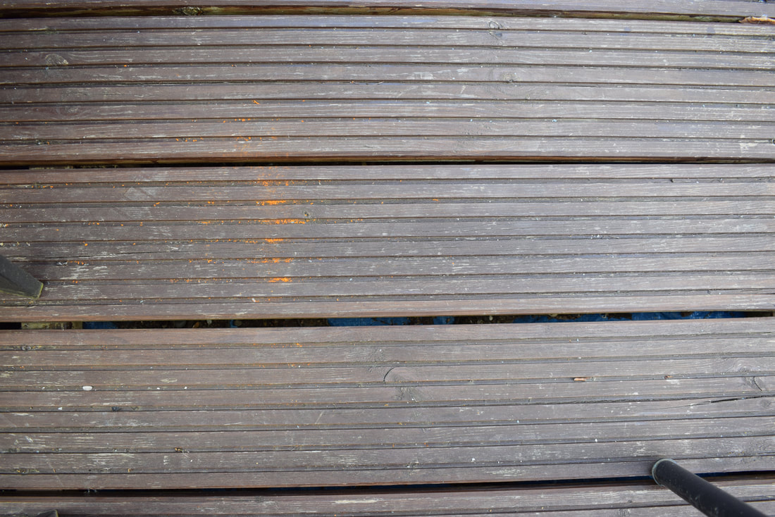
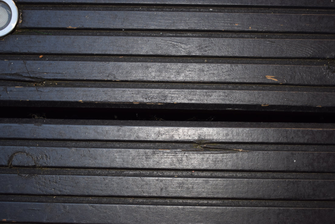
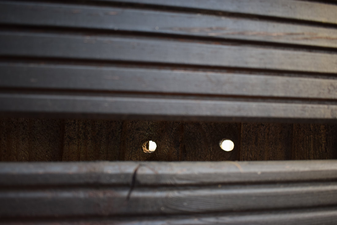
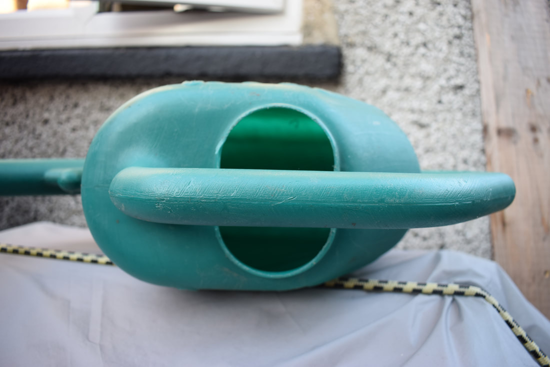
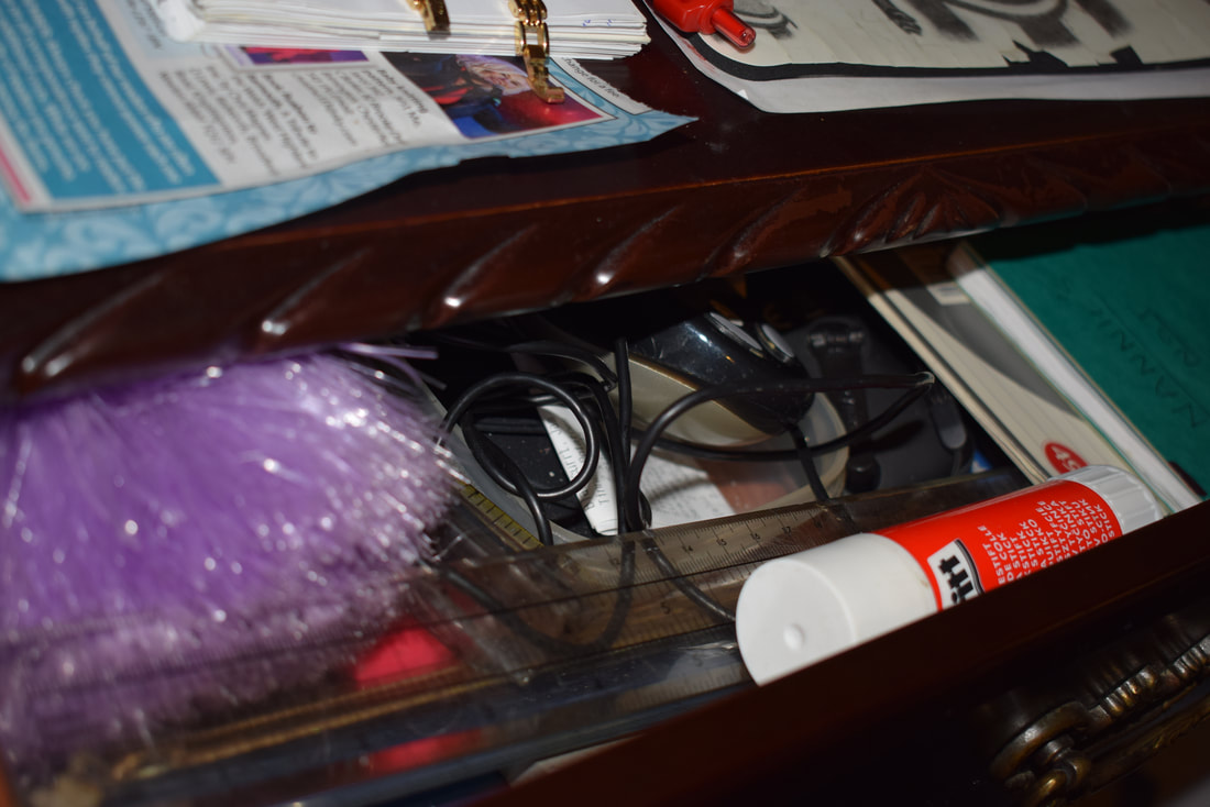
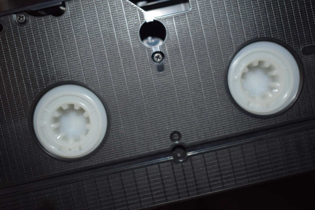
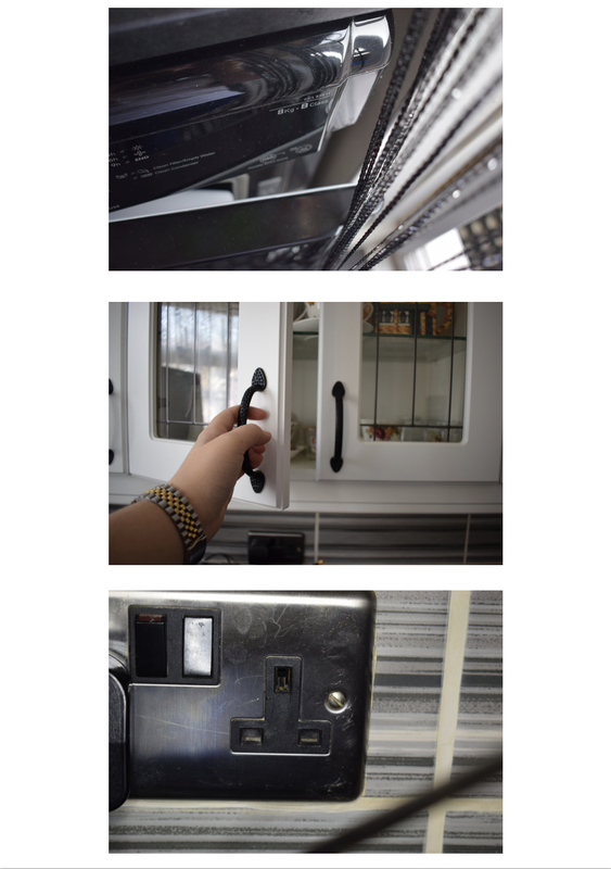
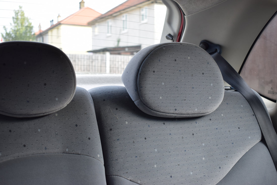
I chose household openings because I found it thought-provoking that nearly everywhere I looked in my house, there were some type of openings.For example headphone jacks in phones, doors, windows, lighters, cupboards, etc.
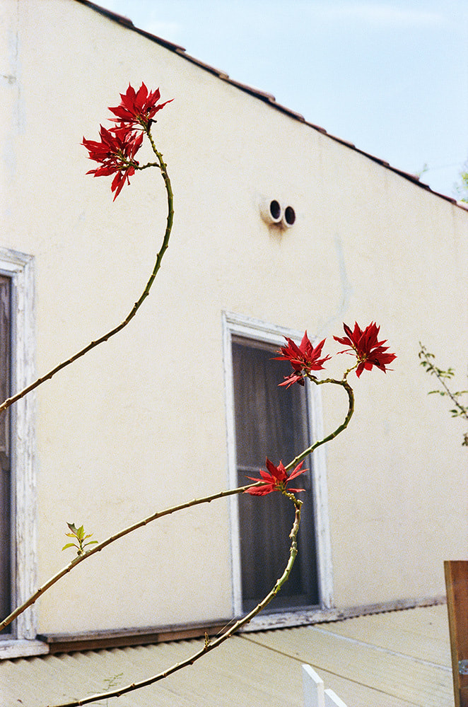
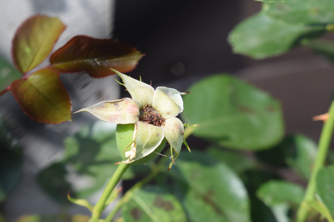
Garden Openings.
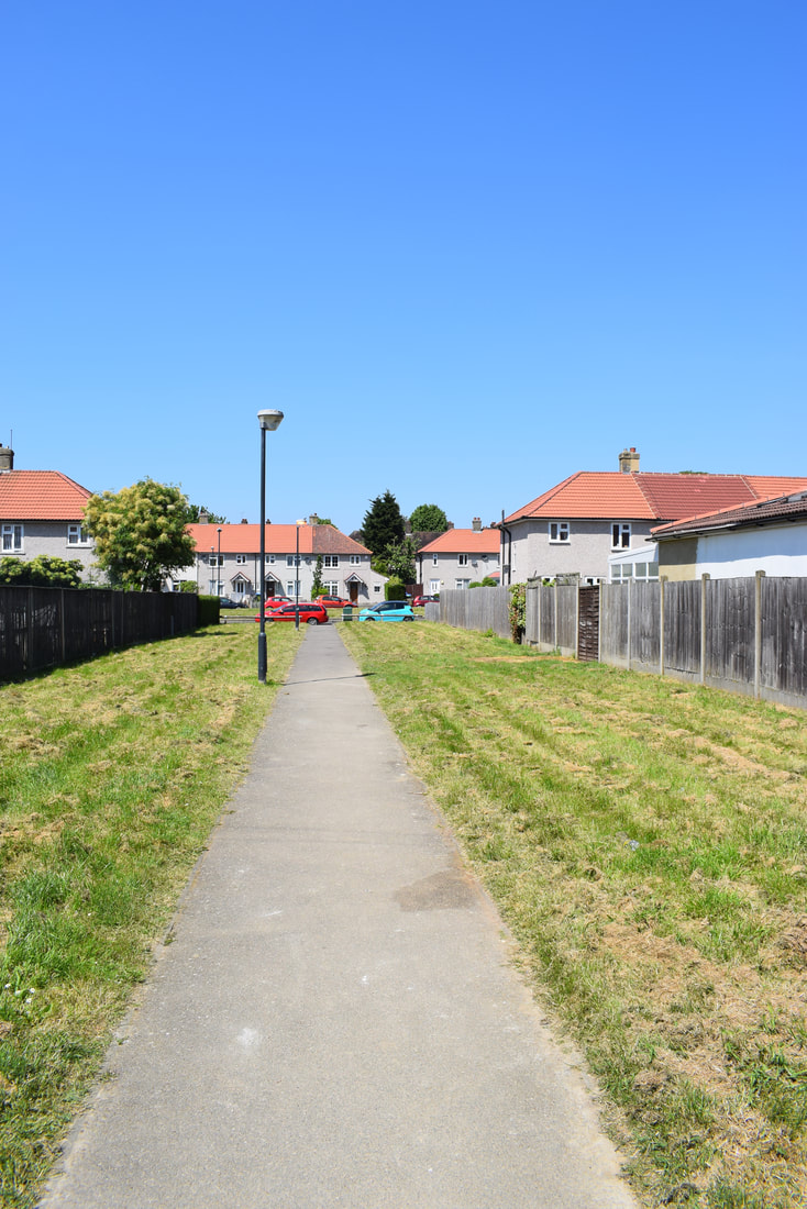
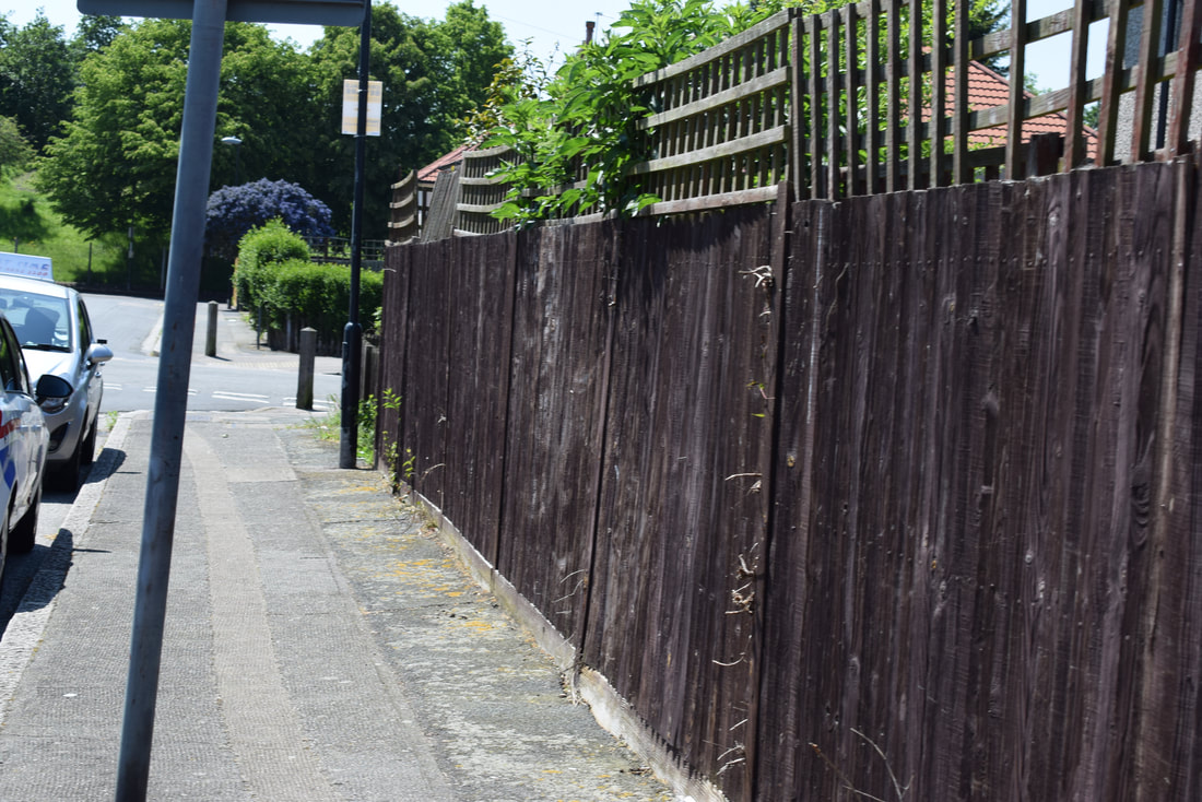
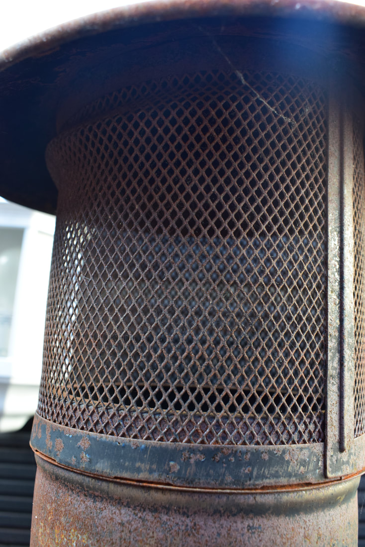
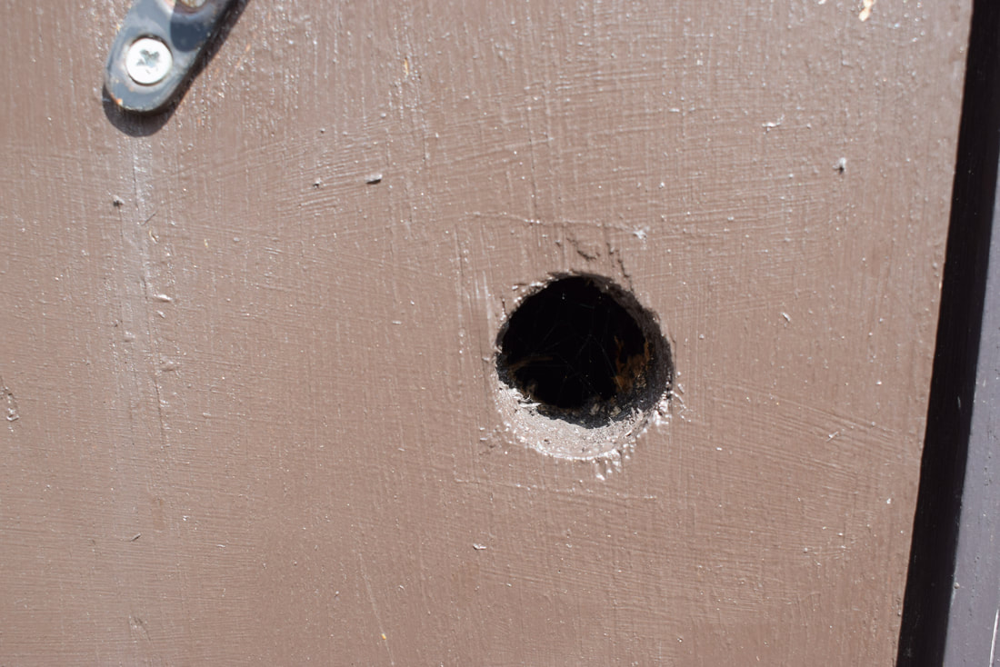
Lastly, I chose to do garden openings because initially I didn't find any openings by just quickly looking, but when I had an in depth look I found more than I expected. For example, holes in doors and fences, flowers etc.
My theme for this project is openings, so I decided to focus on 3 different types of openings. The 3 I chose were facial openings, openings in the garden and household openings. I decided on these 3 types of openings because I found them the most interesting.
Facial Openings.
I found facial openings deeply interesting because with eyes, for example, they can tell a great deal about people, like if they are young or older and you can identify if they have witnessed good and bad things in their life.
Household openings.
I chose household openings because I found it thought-provoking that nearly everywhere I looked in my house, there were some type of openings.For example headphone jacks in phones, doors, windows, lighters, cupboards, etc.
Garden Openings.
Lastly, I chose to do garden openings because initially I didn't find any openings by just quickly looking, but when I had an in depth look I found more than I expected. For example, holes in doors and fences, flowers etc.
HOMEWORK. (10.09.18)
Shizuka Yokomizo.
She is 55 years old (Born 1966, in Tokyo)
Yokomizo is a Japanese photographer who is currently based in London. She went to college, first studying philosophy at Chuo university, before she got her Bachelor of Fine Arts in Photography at the Chelsea College of Arts in London. Yokomizo has done many different projects, two of my favorite of hers are called 'Distance' and 'Dear Stranger'.
'Distance'. For this project, Shizuka's focus of photography and video is the gap between self and other; the incommunicable space that exists between 'me' and 'you'.
'Dear Stranger'. Yokomizo did a project called 'Dear Stranger' in which she sent letters to strangers and asked them to be in a certain place at a certain time so she could take a picture of them. She did this project over 2 years, 1998-2000.
The 'Dear Stranger' project links to my project 'openings' because the window its self is a sort of opening, but it also relates to the strangers opening up and letting them into their homes (theoretically). Also, there are many other different openings in there backgrounds of the images, e.g. doors and cupboards.
Diptych experiment.
For this experiment, I decided to look through my images that I have taken for my theme of openings, to see if I could find a correlation between any of them. Firstly, I look for two images that would work well so I could make a diptych.
For this experiment, I decided to look through my images that I have taken for my theme of openings, to see if I could find a correlation between any of them. Firstly, I look for two images that would work well so I could make a diptych.

To create these diptychs, I used pages on a laptop in school, and chose two images from my exhibition homework. I then put them next to each other in two different ways to see if it would change the way people looked at it as a whole.
Triptych Experiment.
For this experiment, I chose 3 images that are taken from my openings project, and found 3 images that have a correlation.
To create these triptychs, I used pages again and chose 3 images instead of 2, from my summer homework. I then put the pictures in 2 different sequences as I wanted to see if it would change the meaning behind the images.
Look and think before opening the shutter. The heart and mind are the true lens of the camera. - Yousuf Karsh.
I think that this quote relates to my chosen theme of openings because the first part of it talks about the opening of a camera shutter. It also talks about looking before you open the shutter. This makes me think of your eyes which are openings that you use everyday.
This quote has made me think about future experiments and now I'll really look at my surroundings to see if there are any other interesting things around that will look good when taken a photograph of.
This quote has made me think about future experiments and now I'll really look at my surroundings to see if there are any other interesting things around that will look good when taken a photograph of.
Independent learning.
Lee Friedlander.
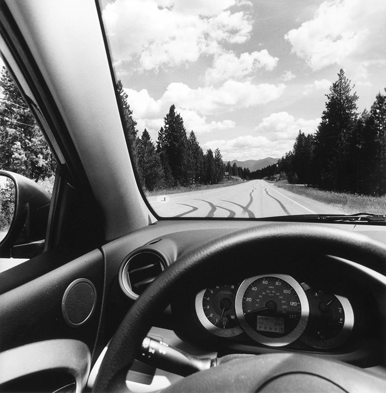
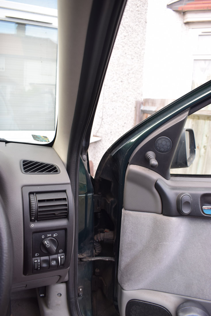
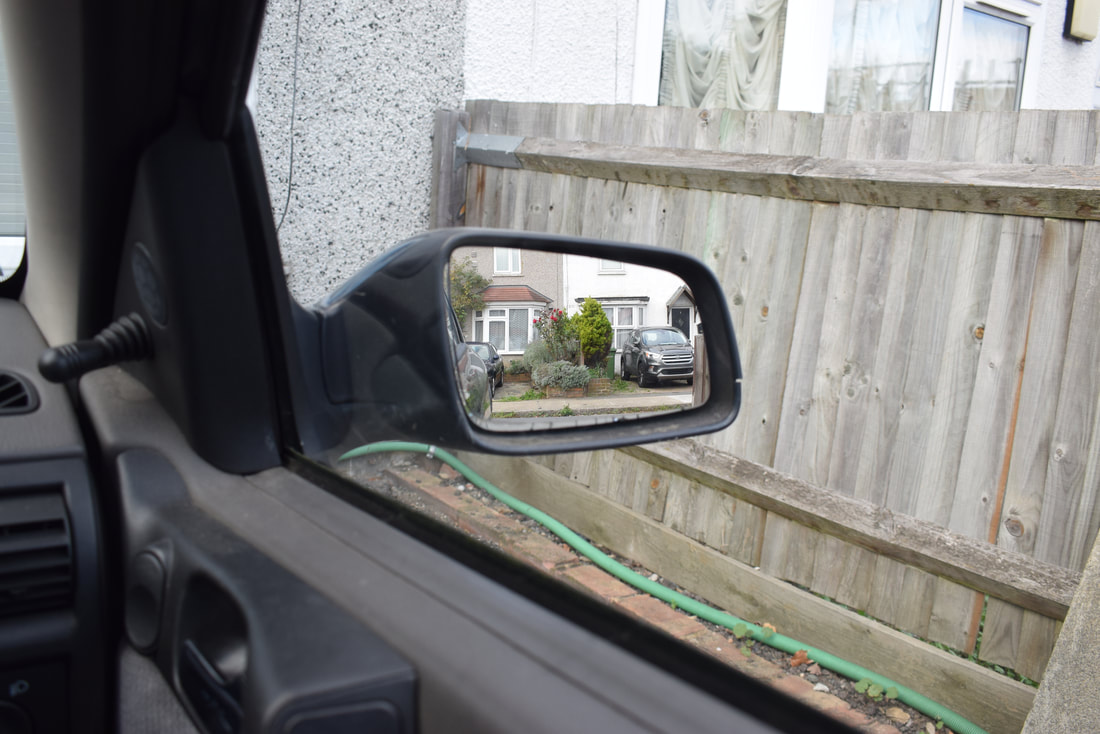
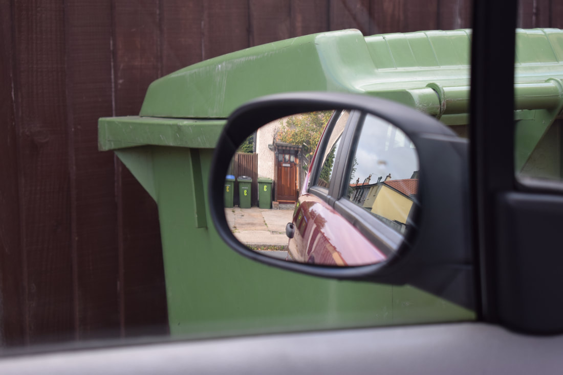
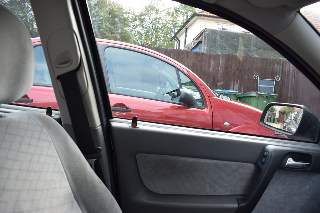
Lee Friedlander is an American photographer who, in the 1960s and 70s evolved an influential visual language of urban "social landscape". Many of his images include fragments of store-front reflections , structures framed by fences, posters and street signs. His project called "America By Car" is especially interesting to me because it has relevance to my personal project "openings", as there are many openings in a car like the windows, doors, air vents etc. I also find it interesting because it gives you an insight to what America is like in modern day, compared to how it used to be (based on his earlier images). Additionally, I like the fact that his images are in black & white because it gives the photographs a vintage feel, even though they are more recent. I think that his images being in black and white gives you a sense of continuity when comparing to his older work, as they are in black and white as well. You have to really look at the images to figure out whether the are his images from the 60s/70s or if they are from more recent years.
The reason as to why I like his images being in black and white is because it makes them seem very classic and old, when in fact they are some of his most recent work.
Lee Friedlander.
Lee Friedlander is an American photographer who, in the 1960s and 70s evolved an influential visual language of urban "social landscape". Many of his images include fragments of store-front reflections , structures framed by fences, posters and street signs. His project called "America By Car" is especially interesting to me because it has relevance to my personal project "openings", as there are many openings in a car like the windows, doors, air vents etc. I also find it interesting because it gives you an insight to what America is like in modern day, compared to how it used to be (based on his earlier images). Additionally, I like the fact that his images are in black & white because it gives the photographs a vintage feel, even though they are more recent. I think that his images being in black and white gives you a sense of continuity when comparing to his older work, as they are in black and white as well. You have to really look at the images to figure out whether the are his images from the 60s/70s or if they are from more recent years.
The reason as to why I like his images being in black and white is because it makes them seem very classic and old, when in fact they are some of his most recent work.
                        Independent Learning. 14.10.2018
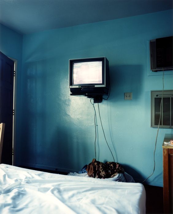
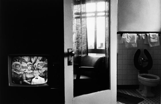
Image Title: "Baltimore 1962." 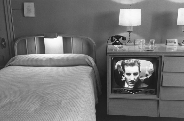
In this image there are lots of different items to look at, and that catch your eye. For example, your eye is immediately drawn to the television set. I think that this image is a still life image because it shows you what was happening in that precise moment in time. The shapes in this image are fairly similar because the majority of them are either square or rectangular. The colours/tones of this image seem quite dull as a result of not having any bright colours.. The whole image is made up of blacks, grays and whites. There is not really anything in the foreground, but in the mid-ground there is the television set and the bed. In the background there is the lamps, telephone and glasses on the top of the television set case. The image has been cropped in such a way that you focus on the television set because there is nothing else around to distract you from the main subject of the photograph. This image differs from real life because it seems very organised, whereas life ins't as organised a majority of the time. The par of the image that strikes me as being the most interesting is the television set because it really stands out from the rest of the image as it has very deep contrast within the image displayed on it. If I could ask the artist any questions about this image, I would ask them why they decided to compose the image in such a way that it seems bland but also interesting at the same time? If I was to give this image a title I would call it 'The Man In the TV' because although it it just a film, it looks like the man is stuck inside the television set and like he wants to be set free. One thing that I think is very effective about this image is the contrasts between the image on the television and the lamps, because it really draws you in and catches your attention.
|
Independent Learning 8 Week Project.
Week 1. I need to research more about Lee Friedlander, and I need to find another photographer to research as well.
Week 2.Carry out a photoshoot inspired by Lee Friedlander. Then edit them in photoshop.
Week 3.I need to take some more photographs, then edit and refine the first set and second set.
Week 4.Document everything I have done so far.
Week 5.Do some more experiments with the images and mirrors.
Week 6.
Week 7.
Week 8.
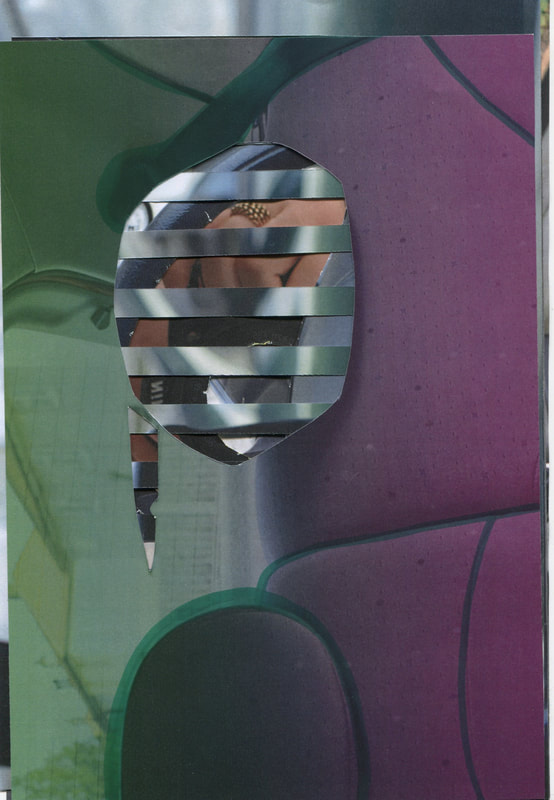
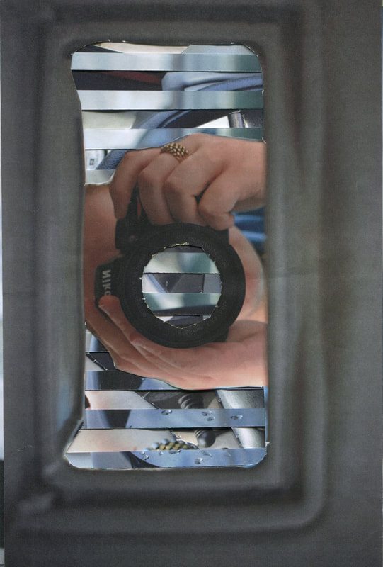
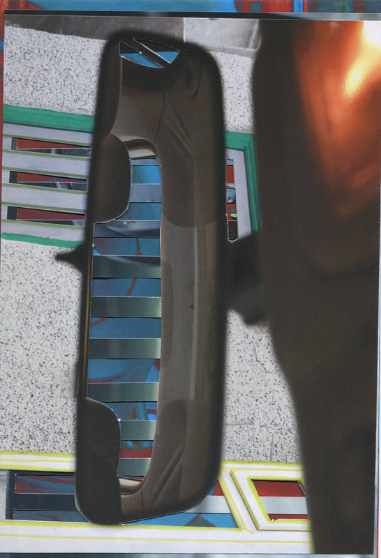
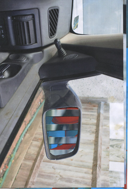
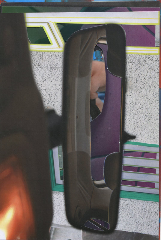
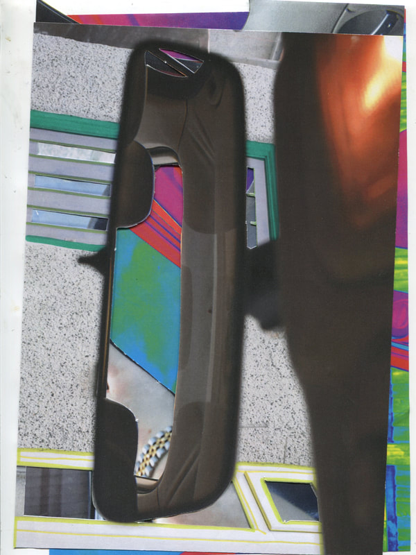
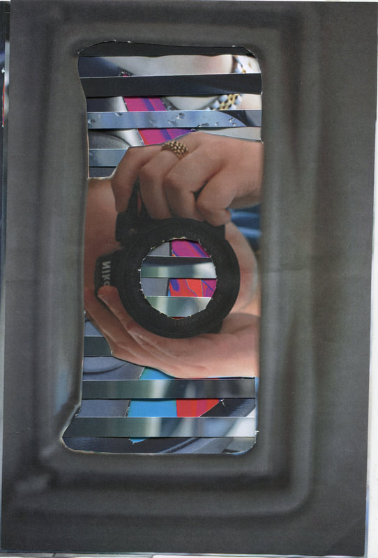
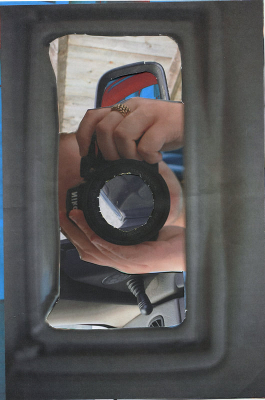
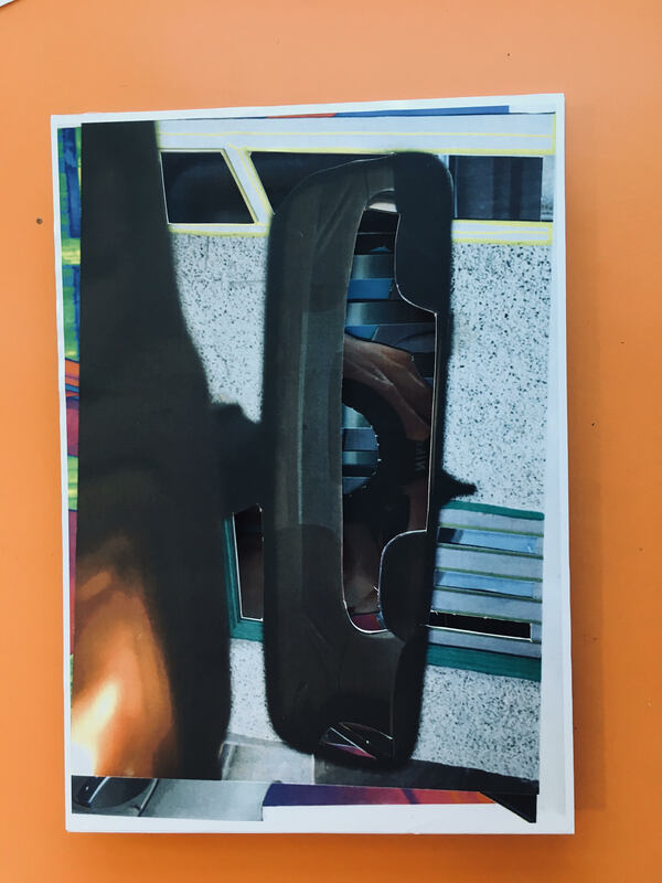
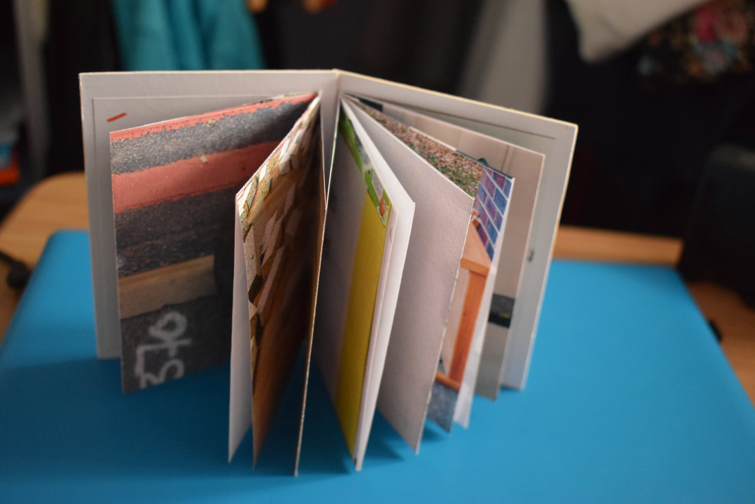
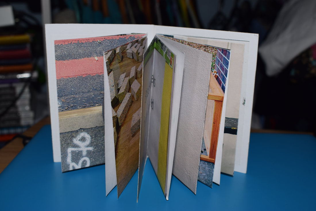
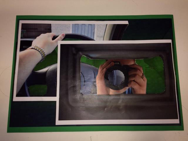
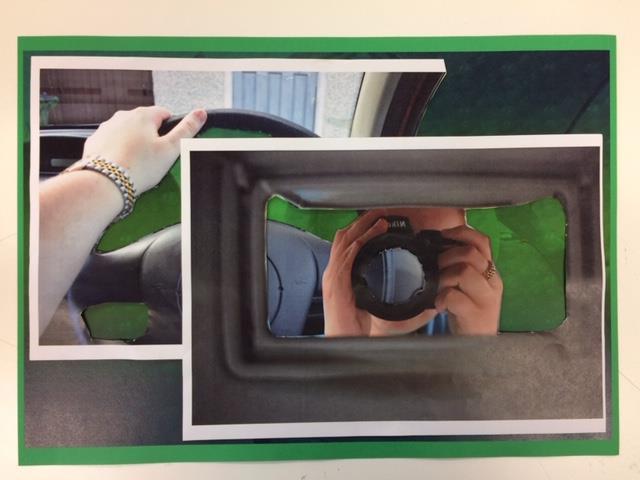
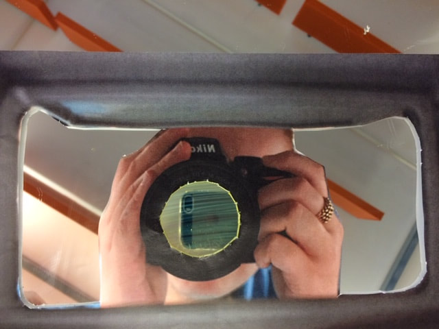
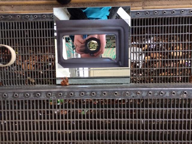
FINAL OUTCOME IDEA.
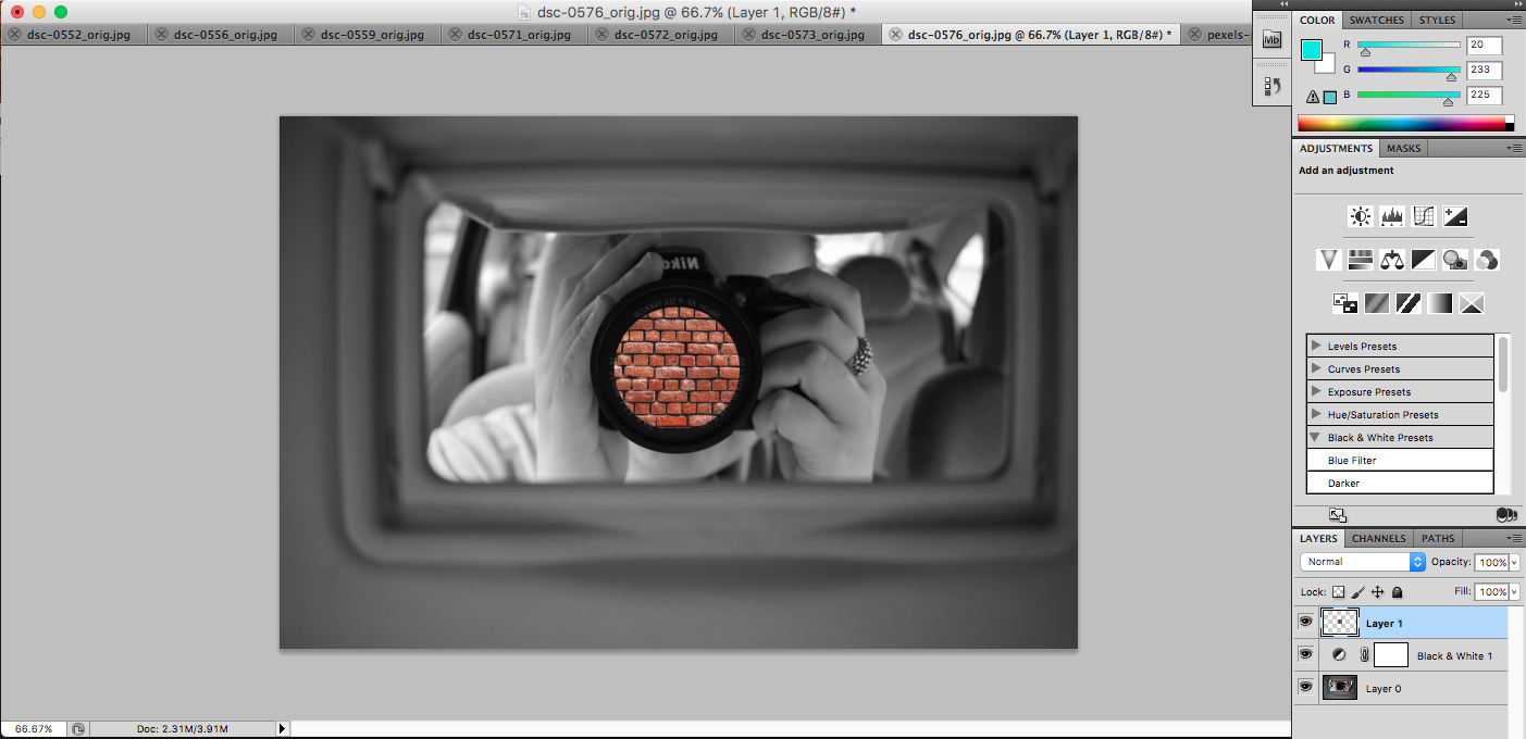
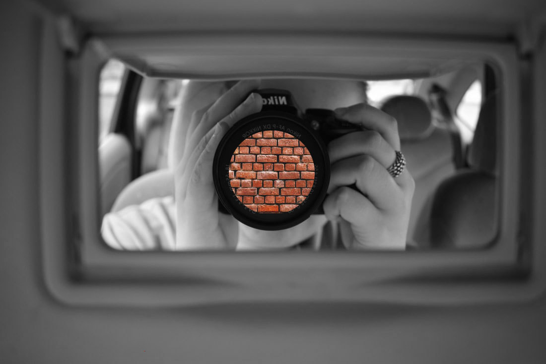
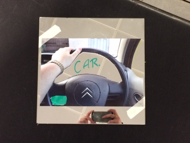
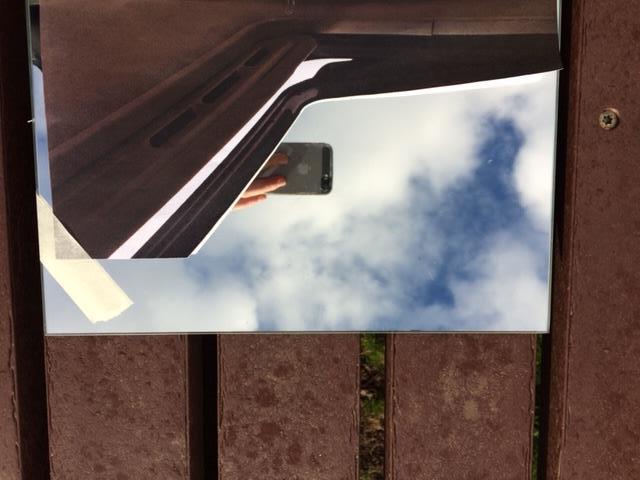
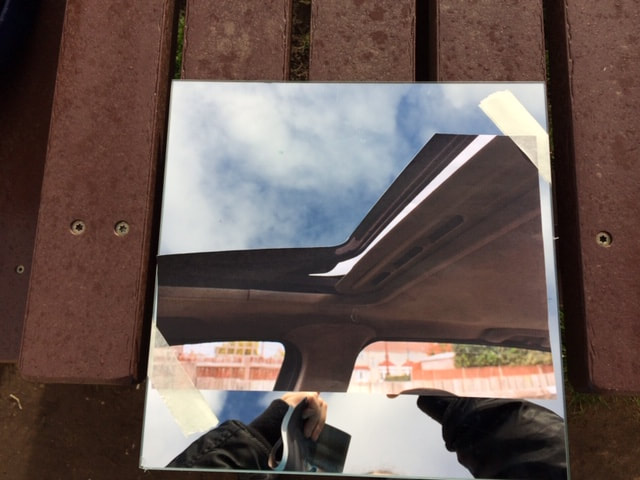
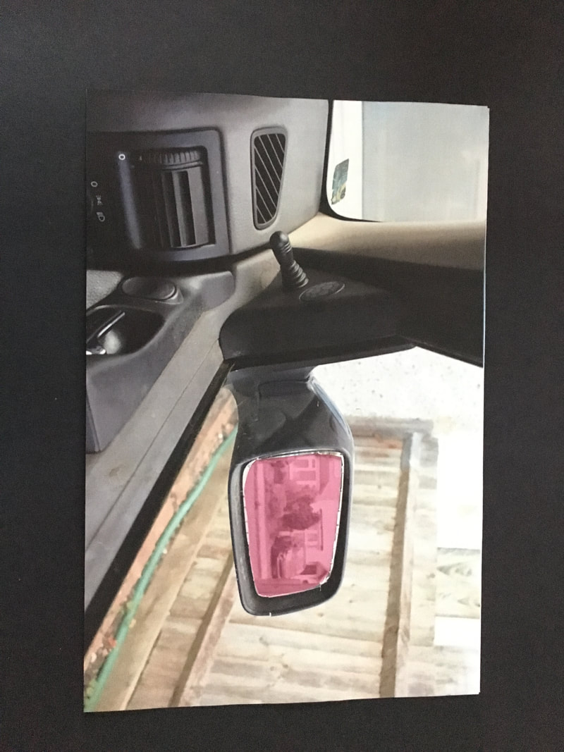
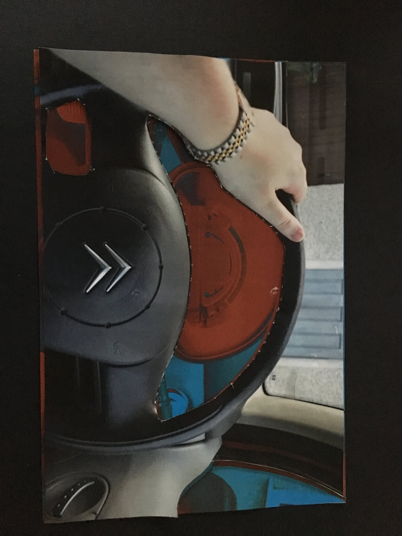
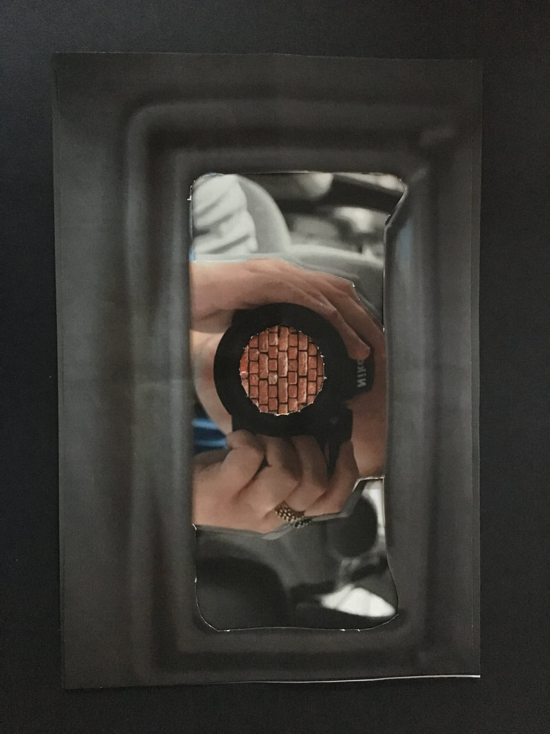
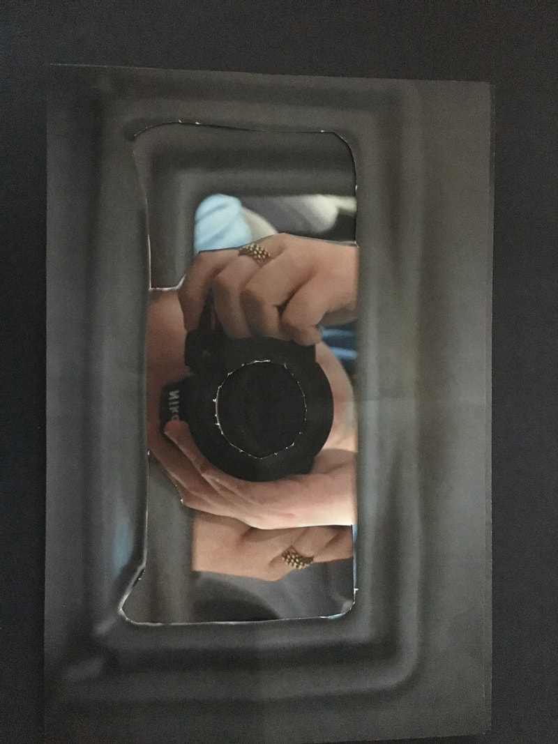
For my final outcome, I am going to cut out parts of my images and place them onto a mirror. Then I'm going to take them outside and photograph them in different places so you will be able to see different reflections in the mirror. These are some experiments I did with my images and a mirror. I cut out some negative space form the images so I could lay them on the mirror and create different photos from the same images. Also, I decided to colour/write on some of the mirror space with a whiteboard pen.
For my final outcome, I am going to cut out parts of my images and place them onto a mirror. Then I'm going to take them outside and photograph them in different places so you will be able to see different reflections in the mirror. These are some experiments I did with my images and a mirror. I cut out some negative space form the images so I could lay them on the mirror and create different photos from the same images. Also, I decided to colour/write on some of the mirror space with a whiteboard pen.
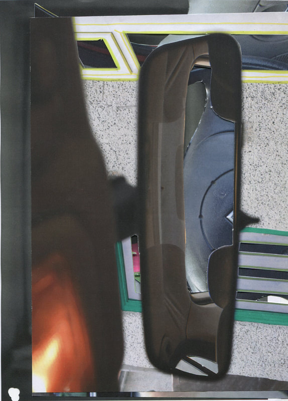
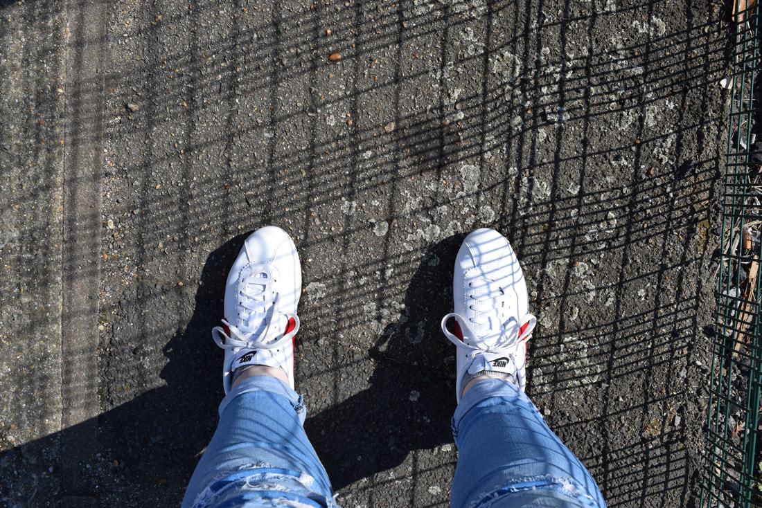
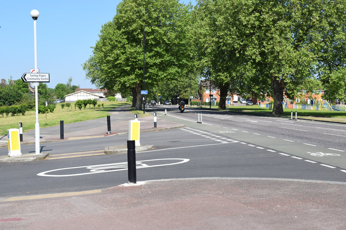
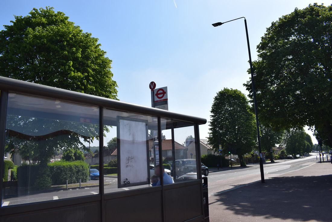
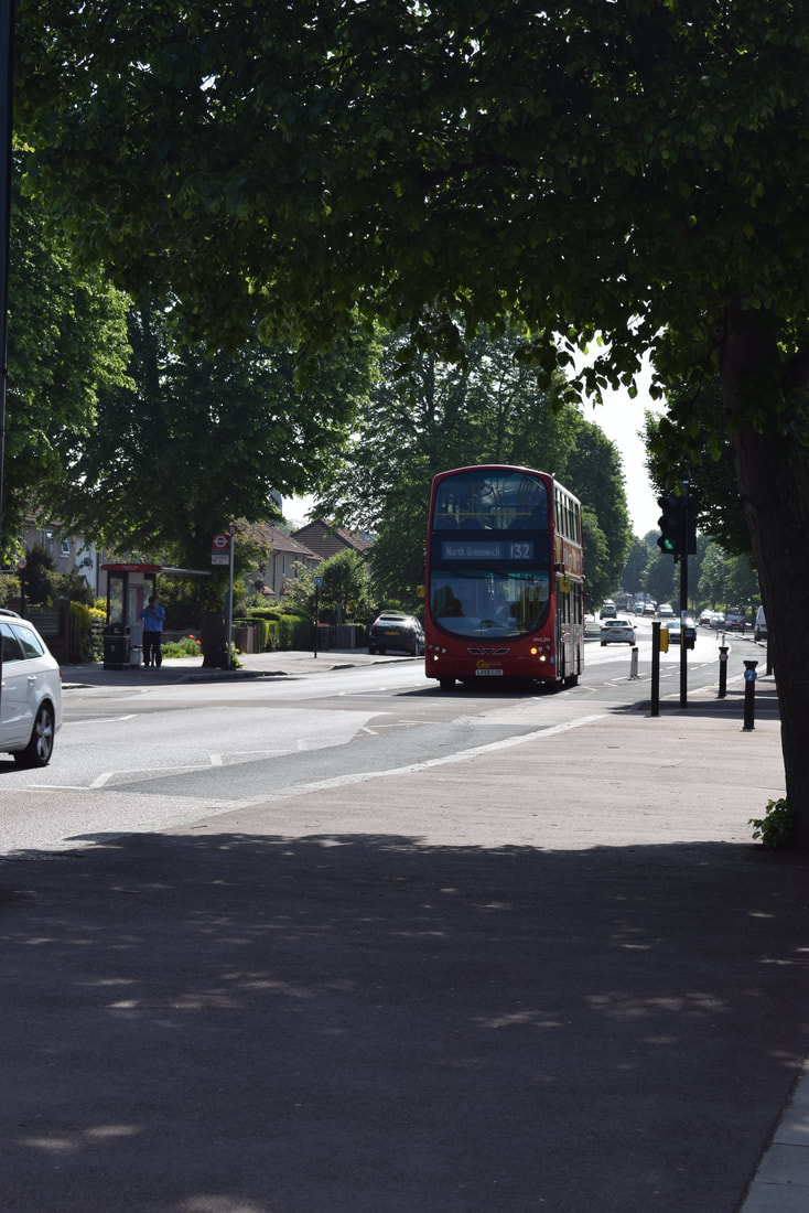
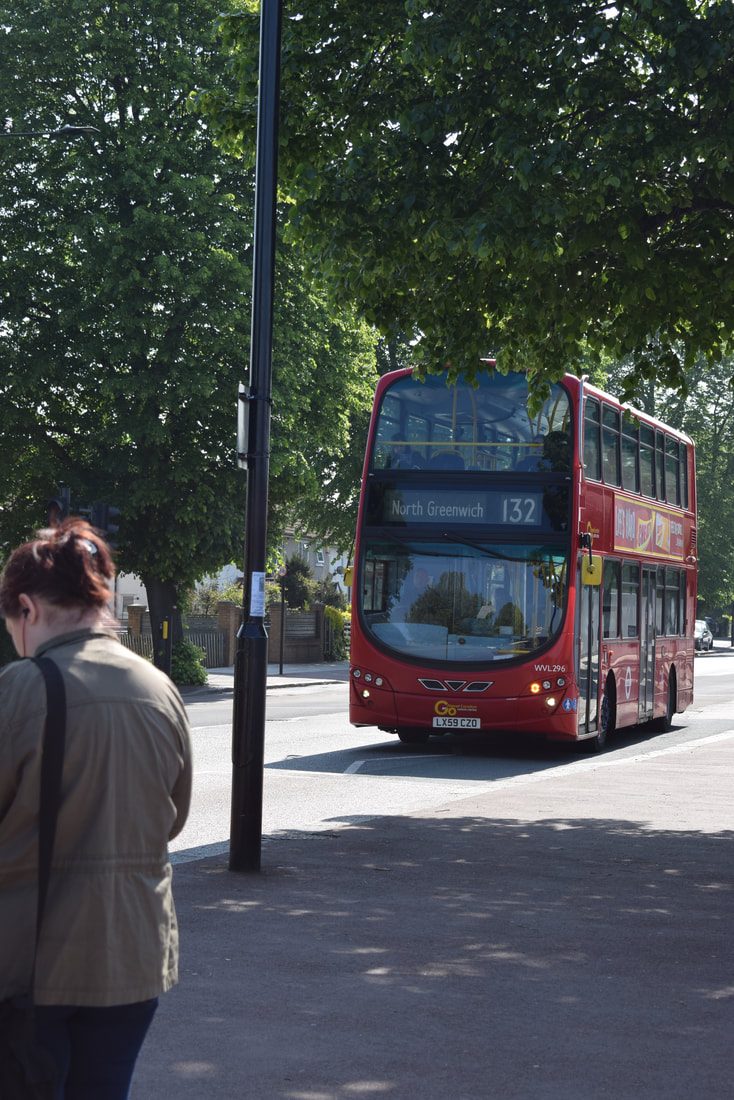
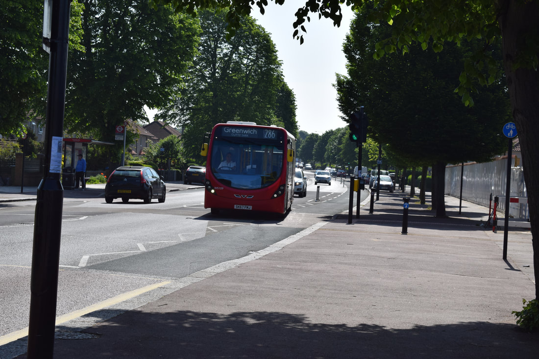
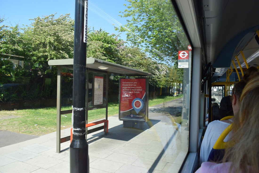
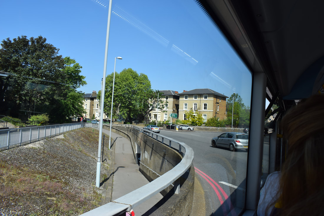
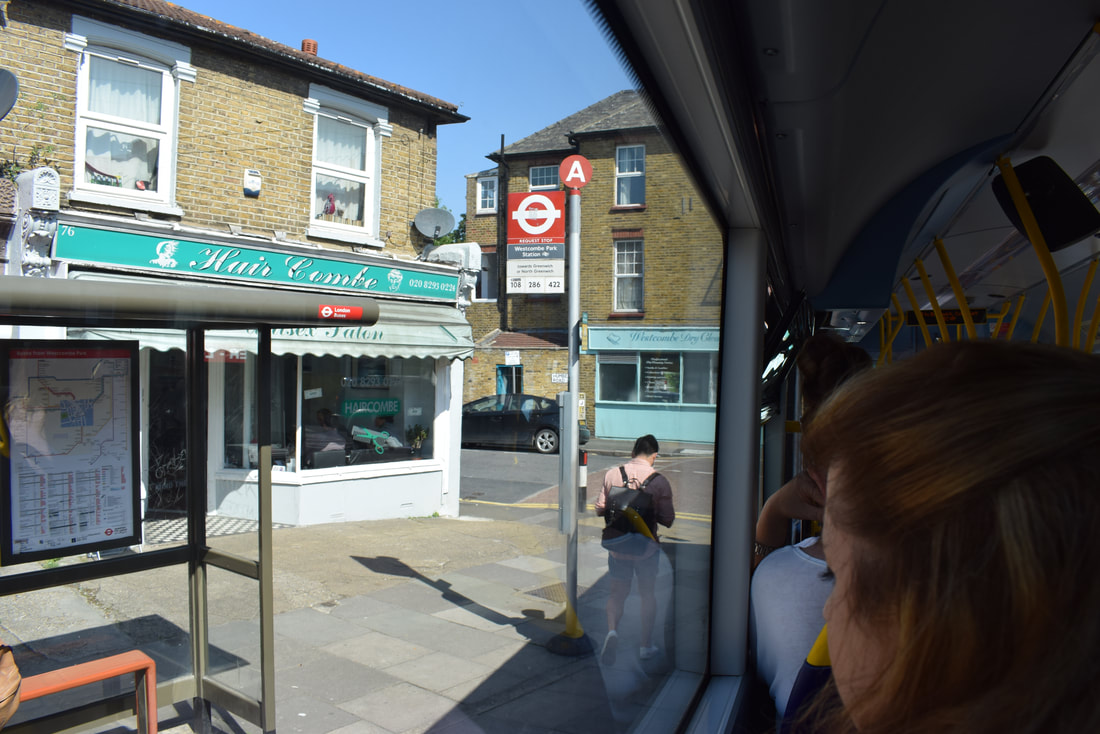
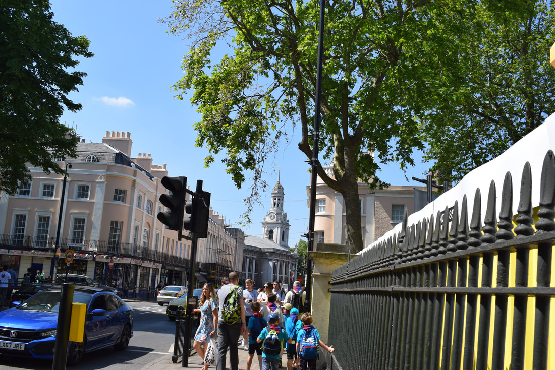
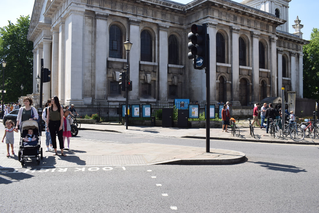
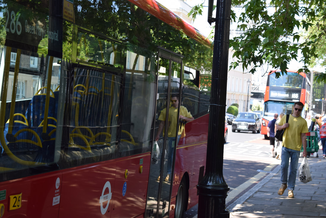
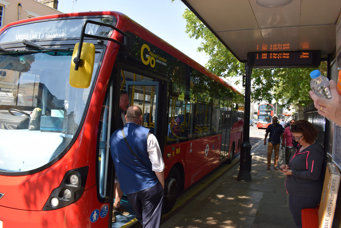
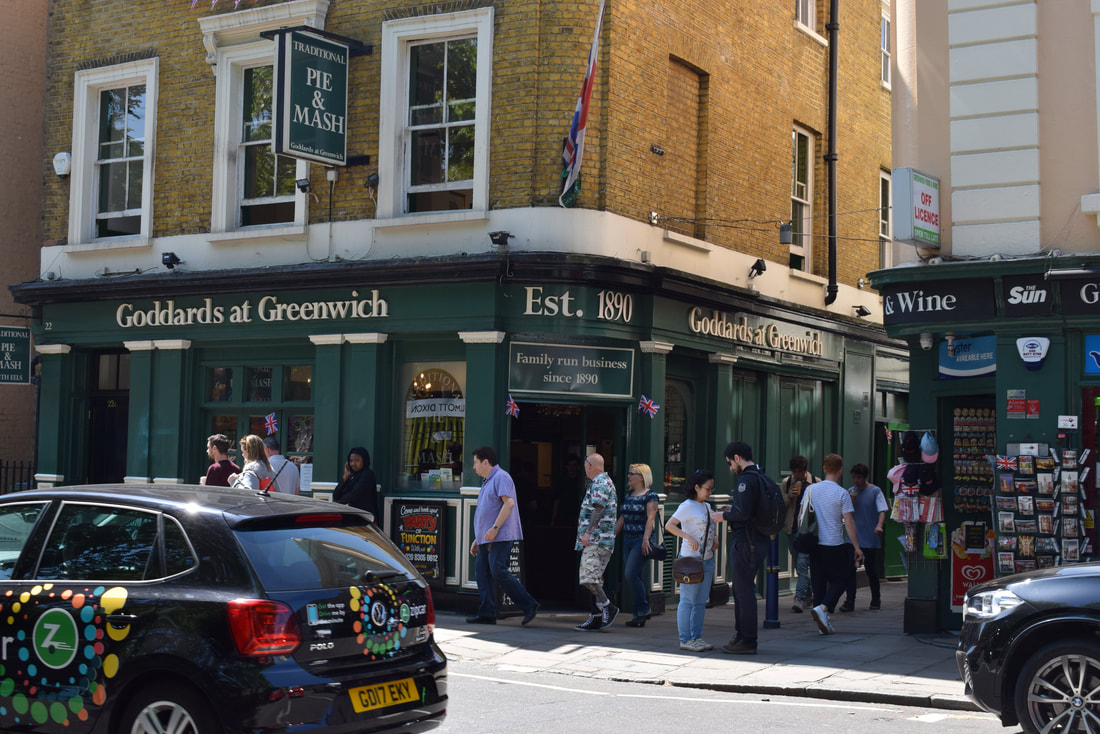
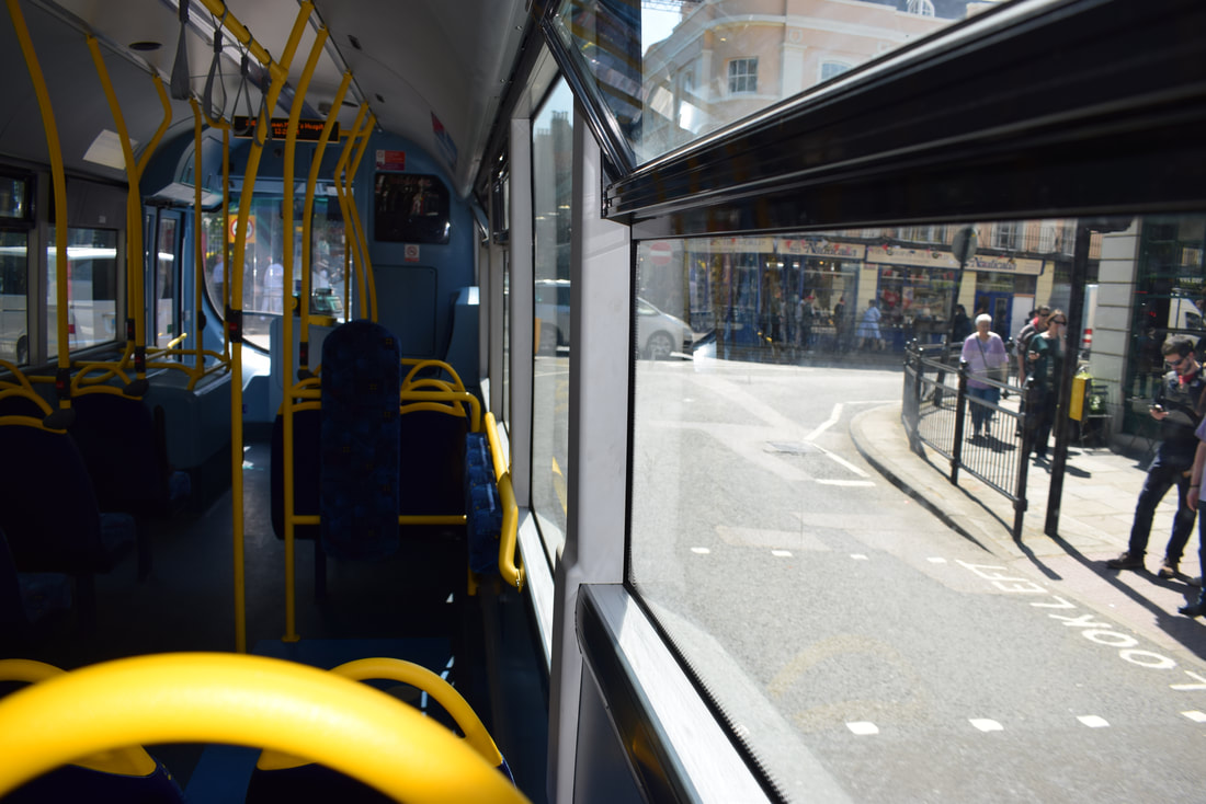
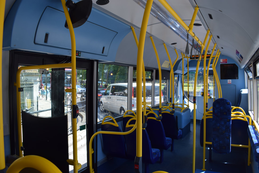
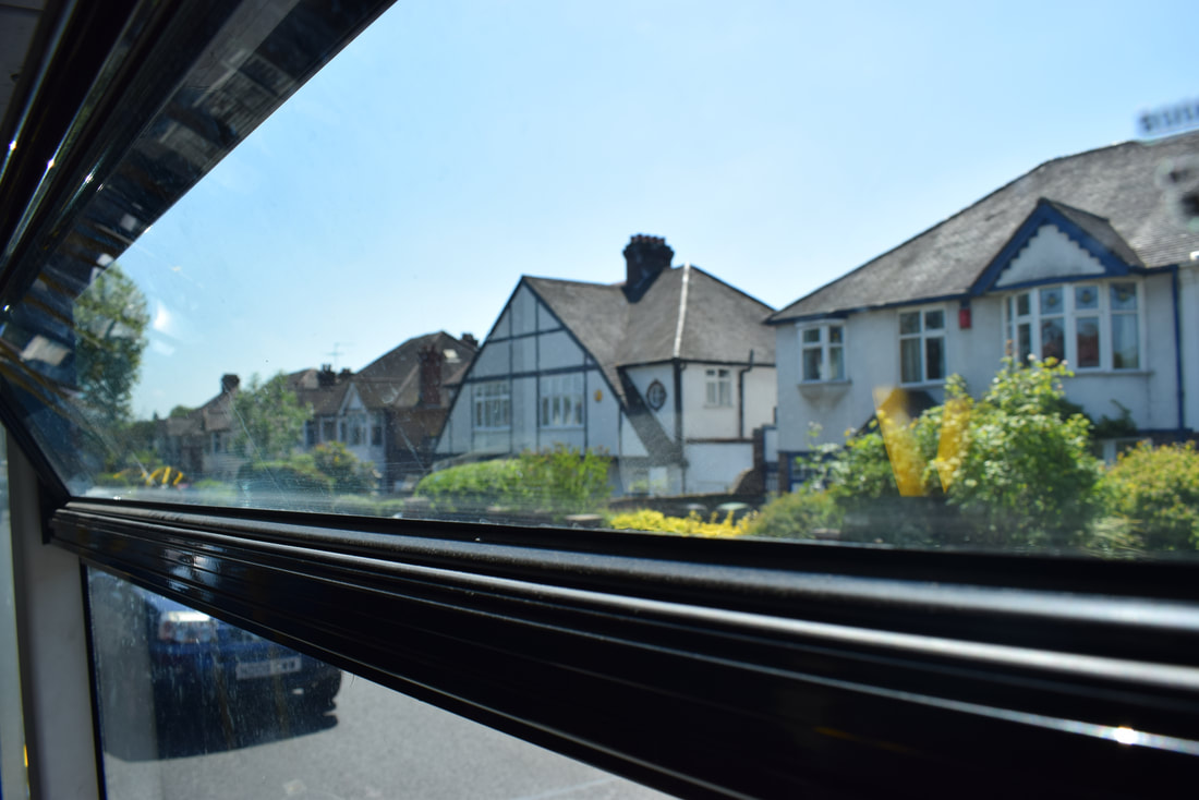
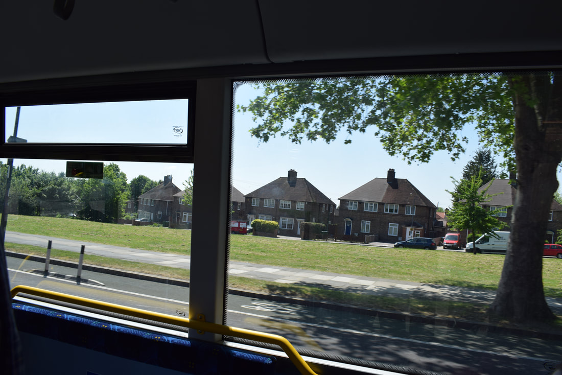
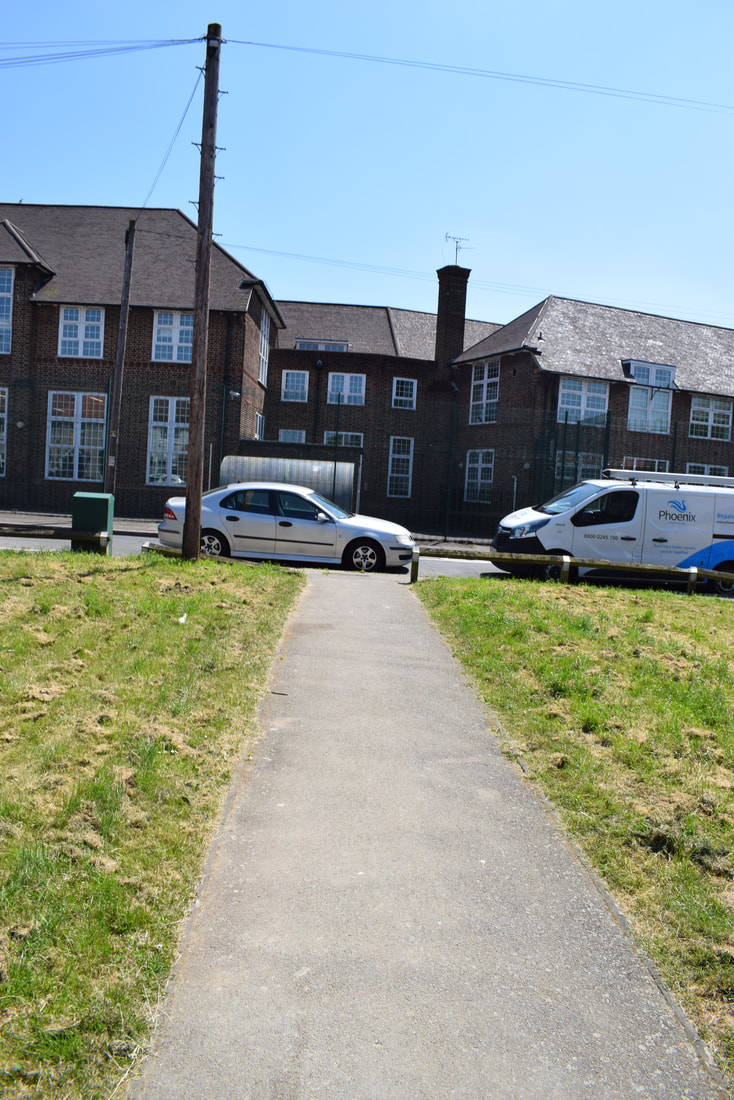
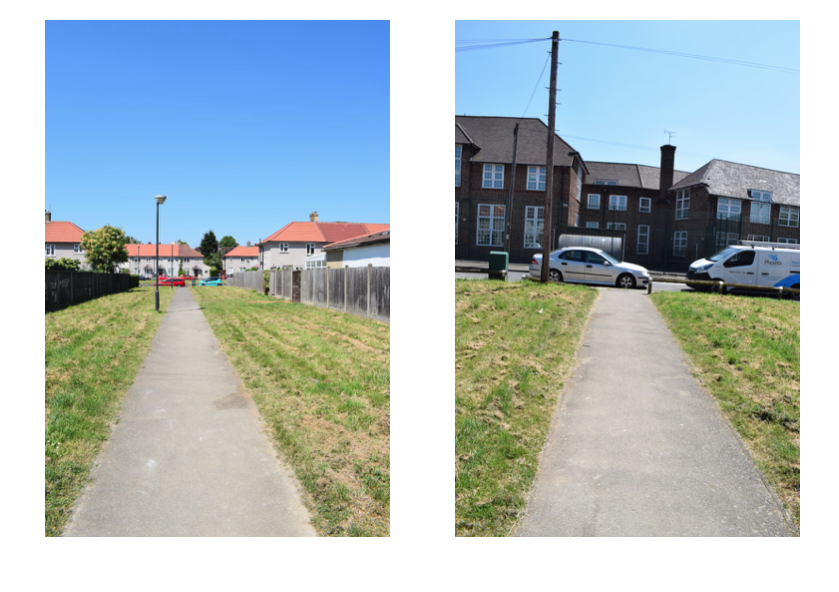
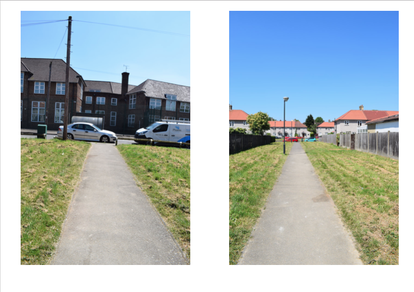
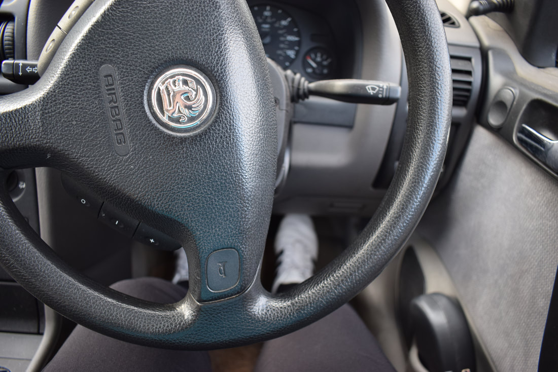
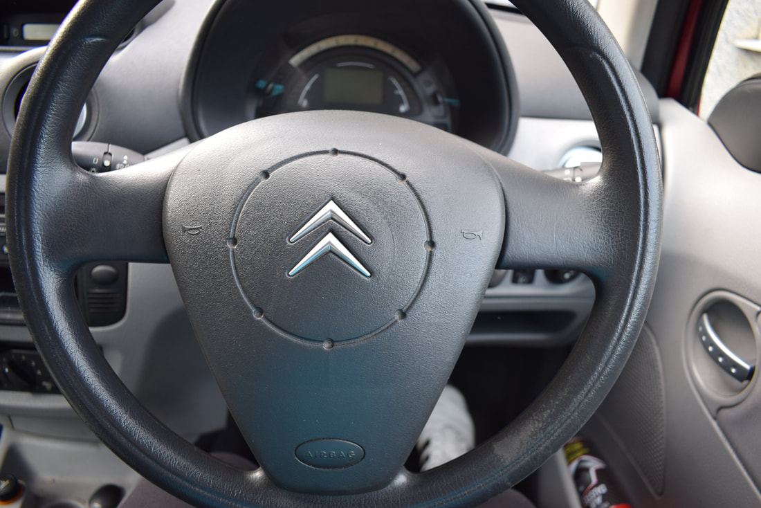
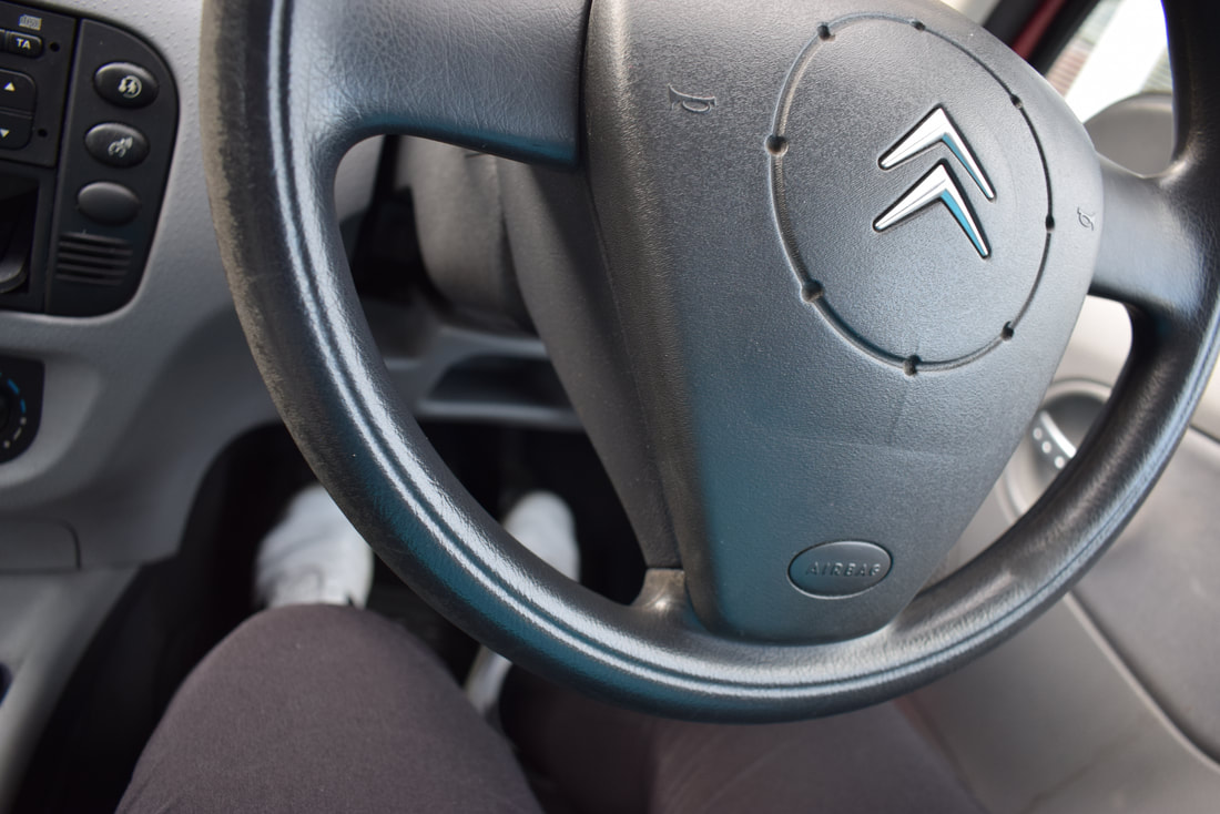
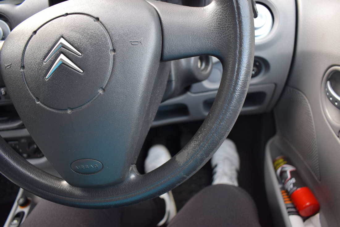
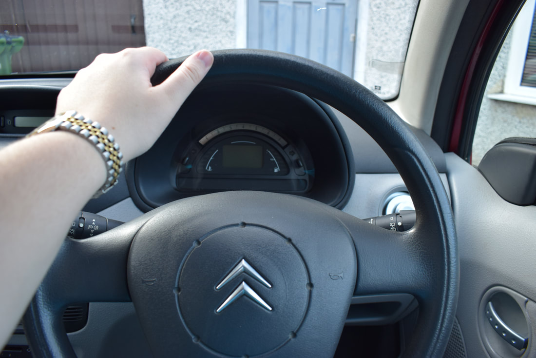
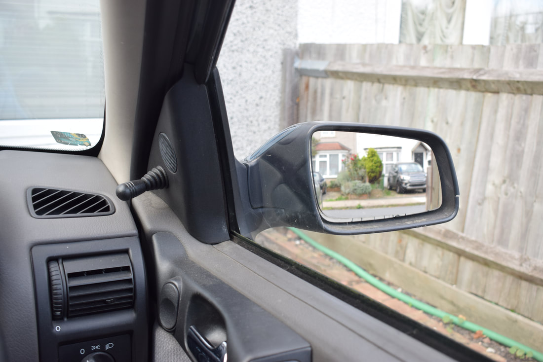
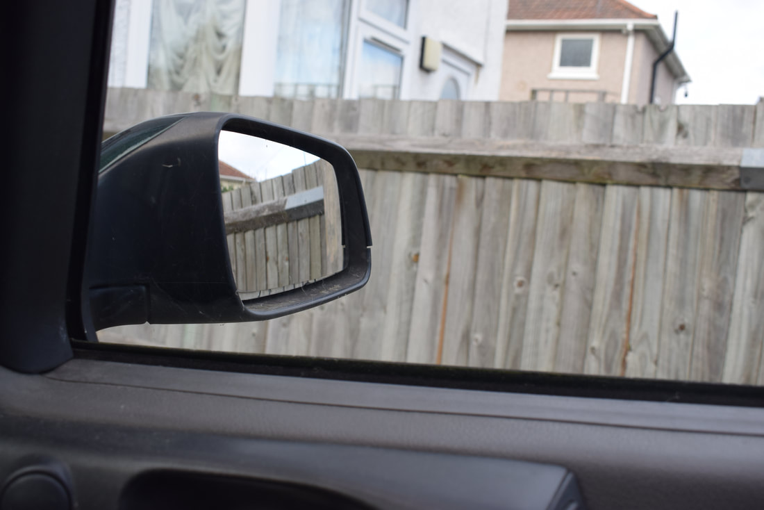
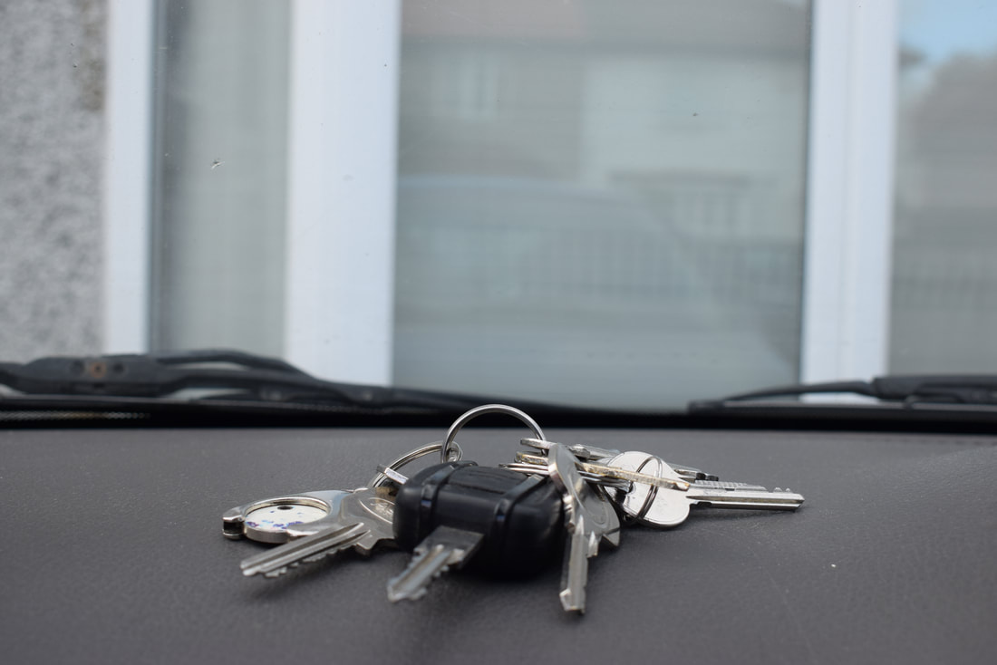
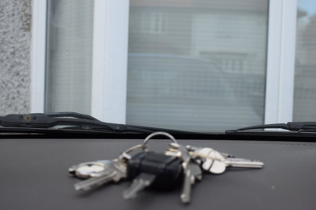
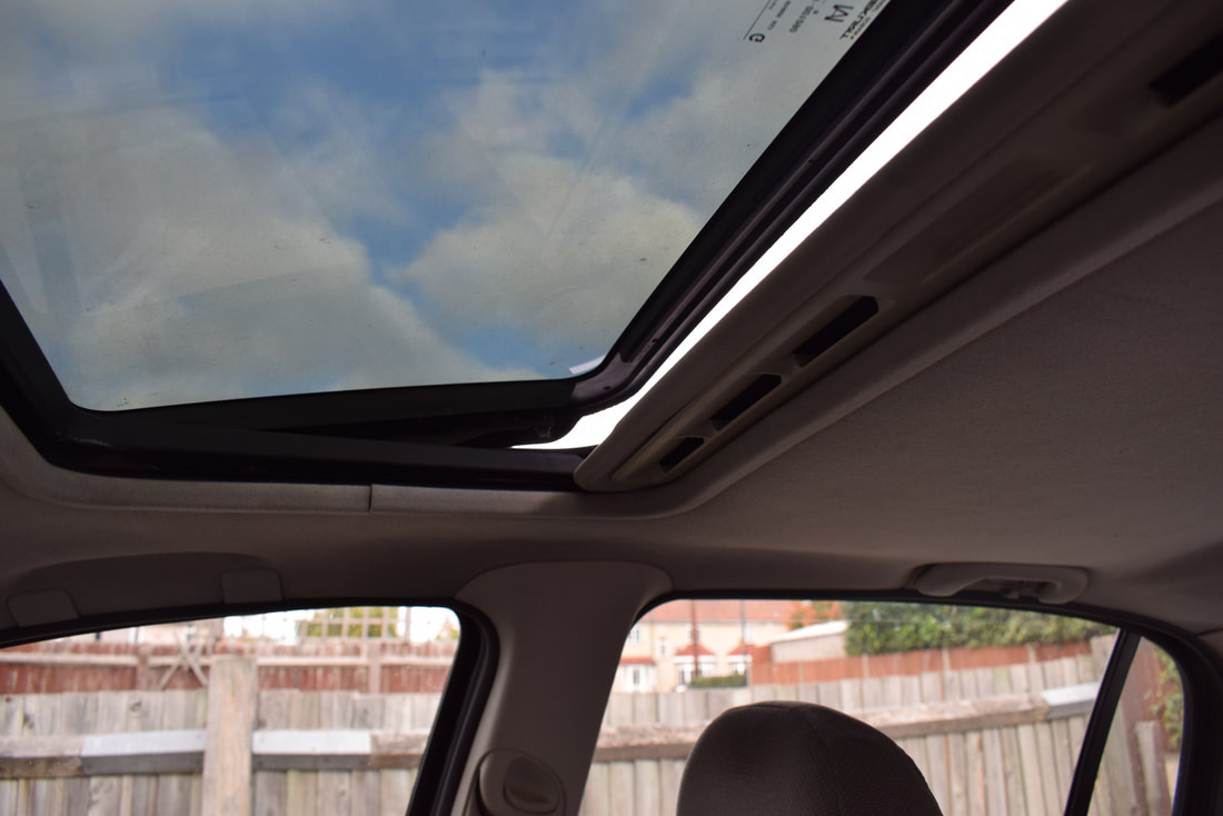
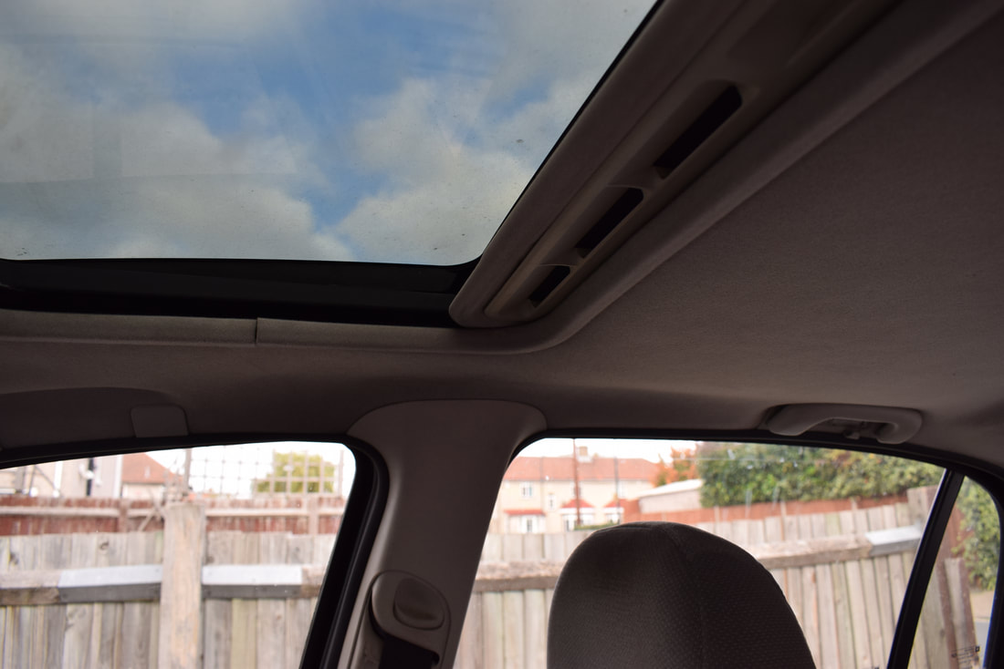
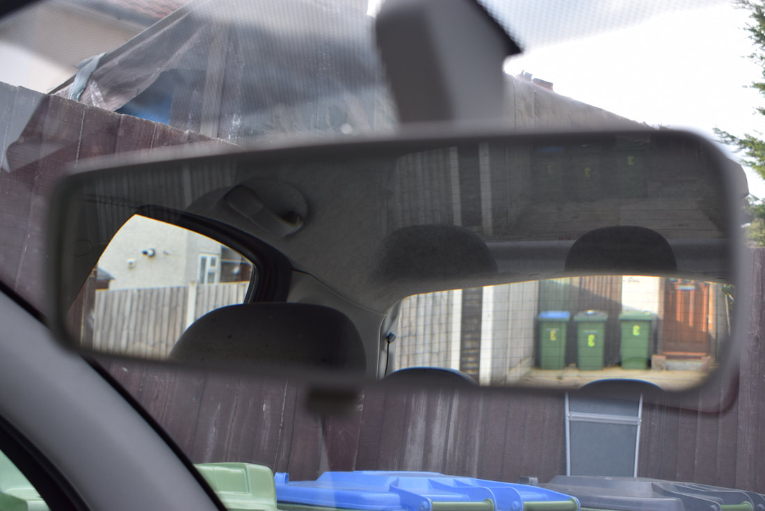
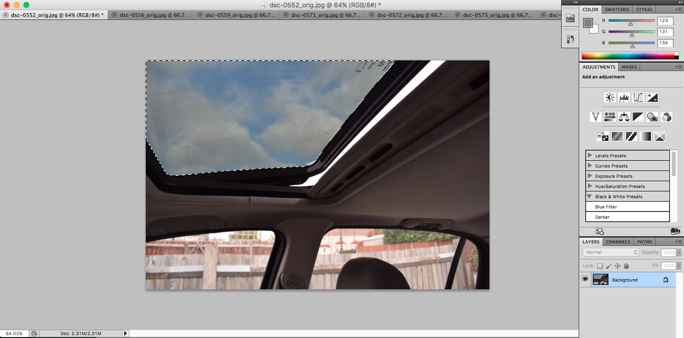
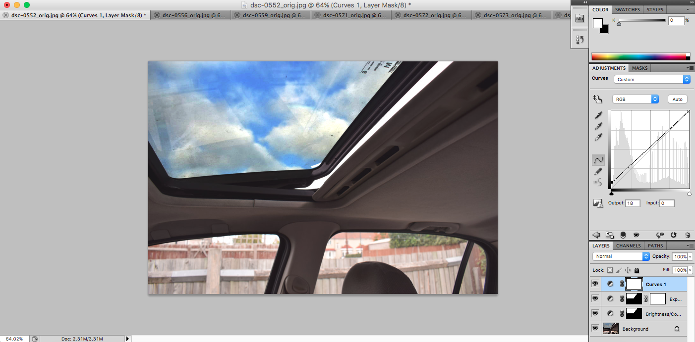
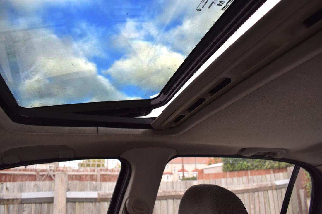
Traffic timelapses from Thomas Tallis School on Vimeo.
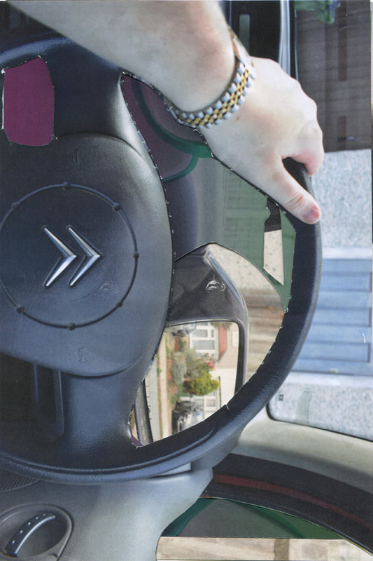
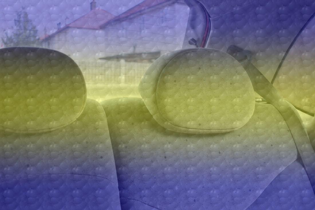
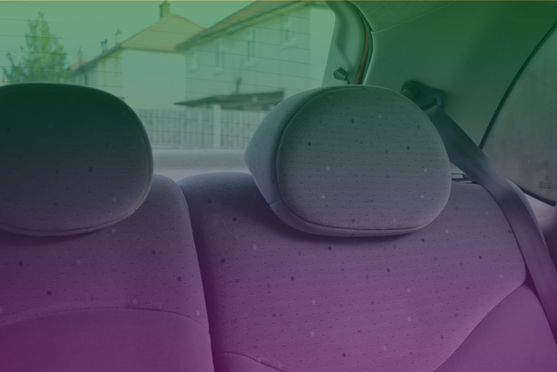
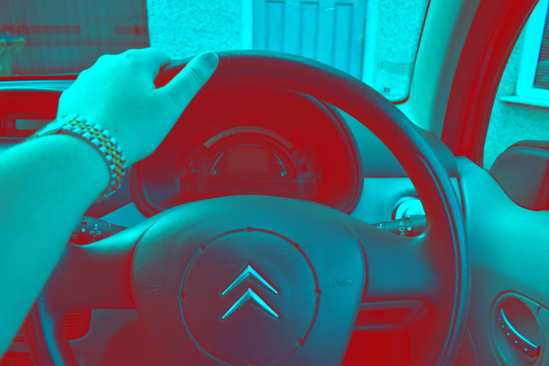
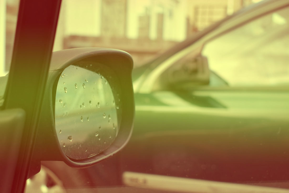
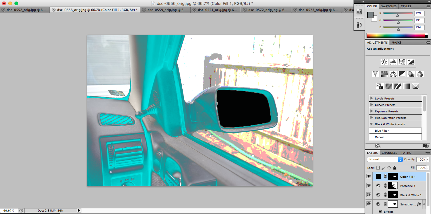
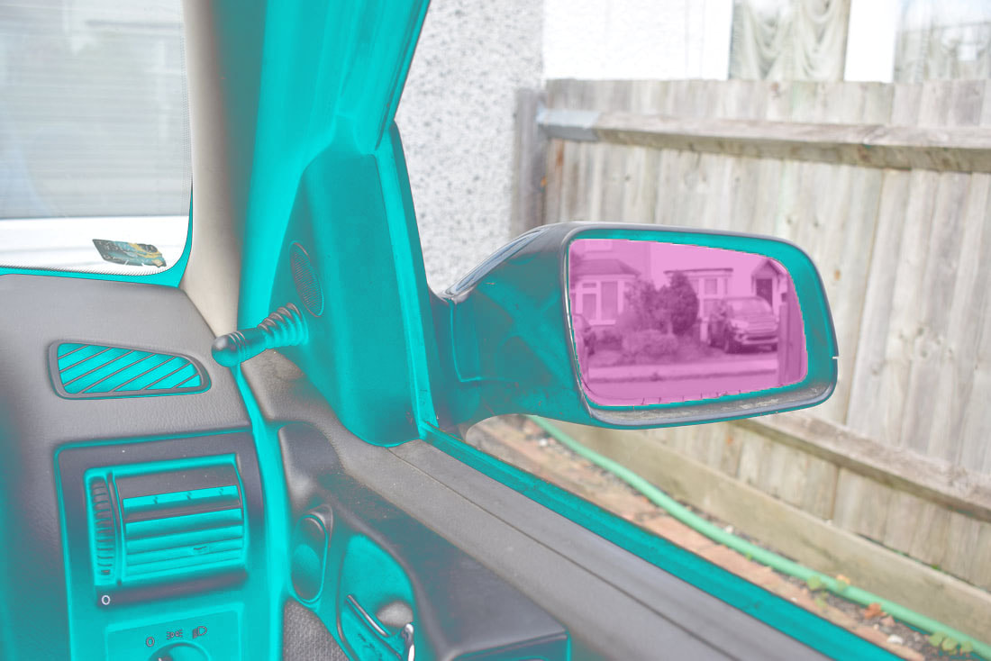
For this part of my project, I decided to create some time lapses of a journey in the car through the windshield and front left window. This idea was adapted from Lee Freidlander's project named "America By Car". I have already 'recreated' various images of his from this series of photographs, and decided that i wanted to create a video that was linked with this. I chose to take the video through the windshield because my project is openings, and I see windows as a type of opening.
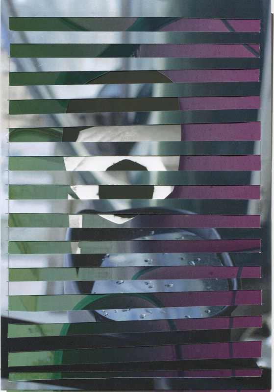
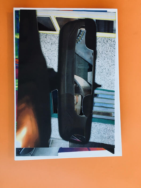
FINAL OUTCOME.
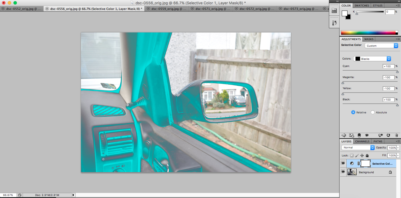
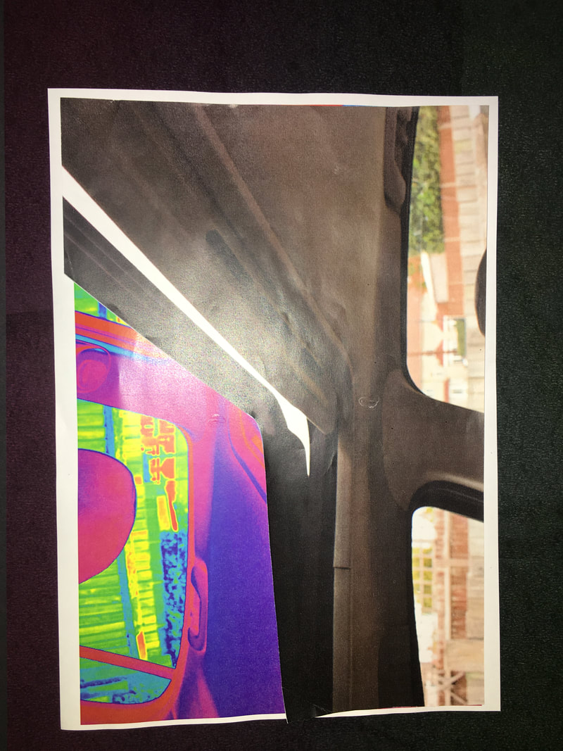
For my final outcome, I decided to create various adaptations on different images I had taken.One of the photographers that I researched is Lee Friedlander. I have looked extensively at his work and the project I liked the most was his project called 'America By Car'. I particularly liked this project because although the image frames are very similar to each other, the things that are in the background are always different. For my take on his project, I decided to take my images in colour instead of black and white. Also, I printed a few copies of each image and 'adapted' them in various different ways. For example; I edited some of them in photoshop and altered the colours, I cut out some of the negative space so that when they are layered you can see all of the images at once, and I also used highlighters to colour in parts of my images. I think that my images worked pretty well because even though I used the same images they all came out very differently. In my opinion my final outcome for this project was very successful because all of the images came out differently and that is exactly what I wanted. Also, I like how the colours contrast with each other and are really bright.
To physically make it, I am going to print out the images on A3 and then glue them onto mount board so that I am able to exhibit them. I am going to have 5 of these so that you can see my favourite 5 combinations of the images.