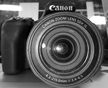
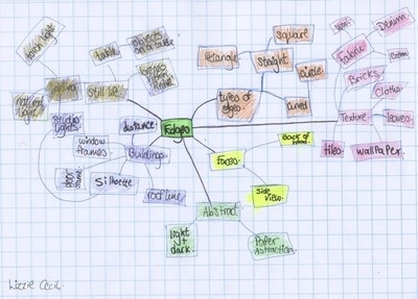
For this activity we had to photograph objects with edges. The best thing about this is that we could virtually take a picture of anything because when you take a picture of something, it will have an edge even if in real life it doesn't look like it has one.


School Edges Gallery.
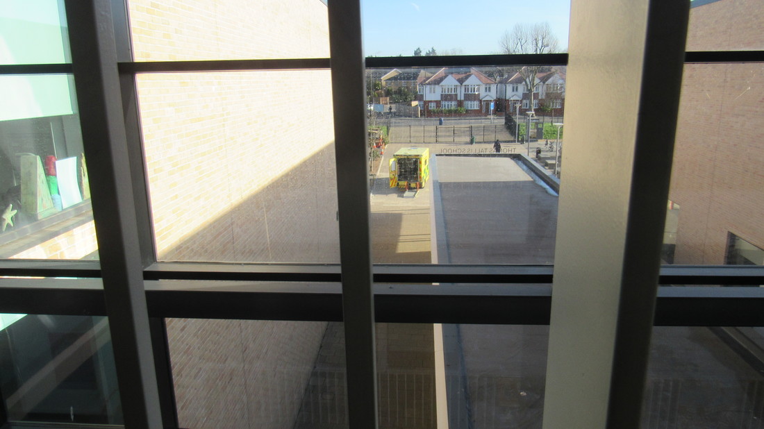
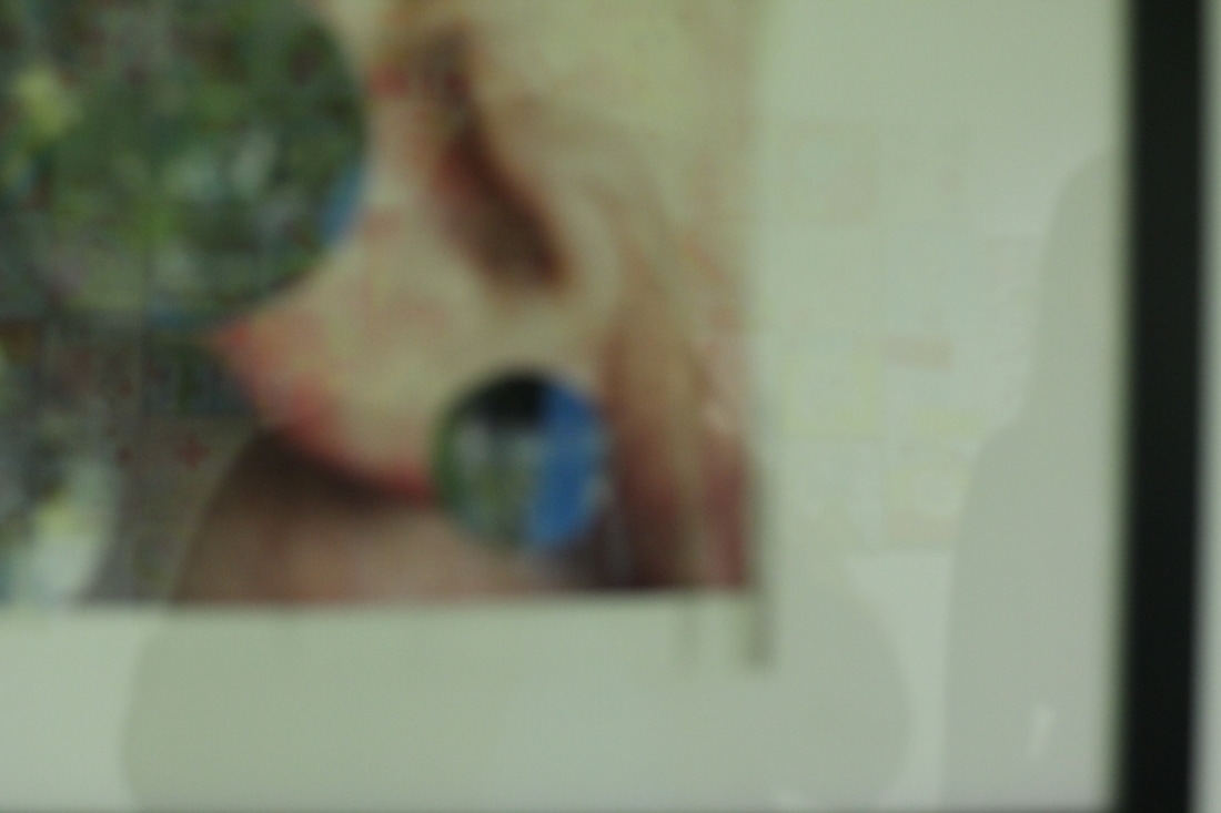
For this activity we had mirrors and a camera .
We had to go around school, putting the mirrors in different places and taking pictures.
For this activity we had mirrors and a camera .
We had to go around school, putting the mirrors in different places and taking pictures.


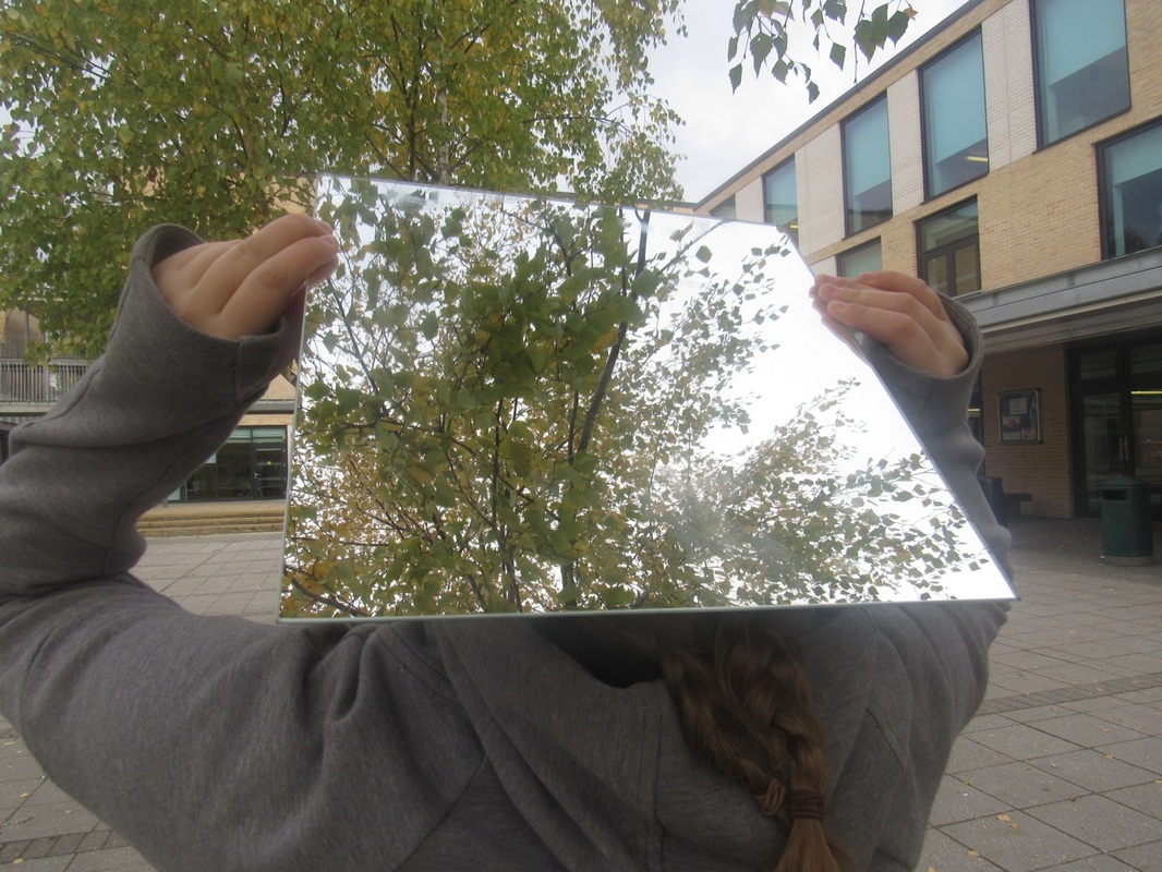


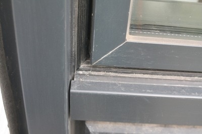
This photo worked the best because it isn't blurry and the reflection on the mirror is clear. I like this picture aswell because the top part of the mirror sort of blends in with the tree in front of it.
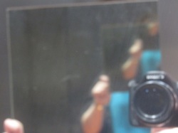
This photo didn't work very well because the camera moved and it's fuzzy.
Light Photo shoot
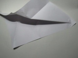
For this photo shoot we had to fold the paper in different ways and use a light to cast a shadow on it. Then we had to take abstract pictures of the paper.
For this photo shoot we had to fold the paper in different ways and use a light to cast a shadow on it. Then we had to take abstract pictures of the paper.


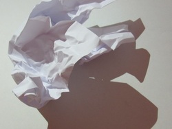
Overall, the paper shoot was quite successful. I was surprised by my outcomes and in particular I think that this photo worked really well because the paper is the main focus and there is a high contrast between the shadowed and light areas.
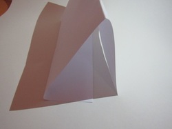
I think this photo didn't work very well because you can see the orange in the background, the shadow isn't very dark and the way the paper is folded is really simple. If I was to do this paper photo shoot again I would make sure you can't see the orange and that the paper was folded a bit more complex to make more interesting images. Also, to make the contrast even better I would go in the dark room.
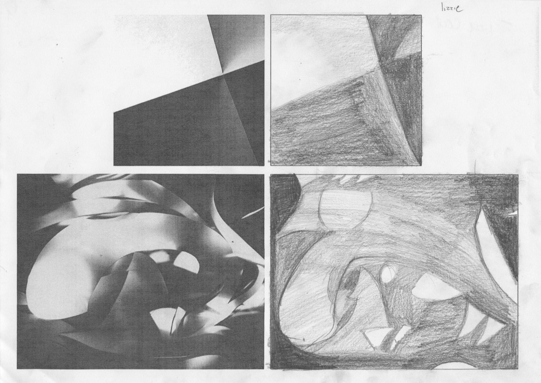
We were given a worksheet that had two different pictures on and we had to draw them. The top picture was easier to draw because it is very simple. The bottom one was difficult because of the curved lines and the light and dark parts.
Overall the top drawing worked well because it looks like the picture but some parts are a bit too light when they are supposed to be dark. The bottom drawing didn't work very well because most of the shadowed parts I drew are too light and I missed out some of the shapes. If I was to do this drawing again I would look more closely and carefully at the picture that I am drawing.
This was our second light photoshoot. For this one we had tto do the same thing as we did before, but we had to try and use the paper in different ways.


I think that this picture didn't work very well because it is very fuzzy and there isn't much of a contrast. If I was to do this again, I would be more patient when taking the pictures and try not to rush the process.
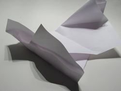
I think that this picture worked really well because we had 3 different shadows by using 3 phones with the flash. Also, this picture is in focus and you can't see the background which is why I like this picture a lot. I really like the composition of this picture. I thought hard about where to place the frame when I looked into the view finder.
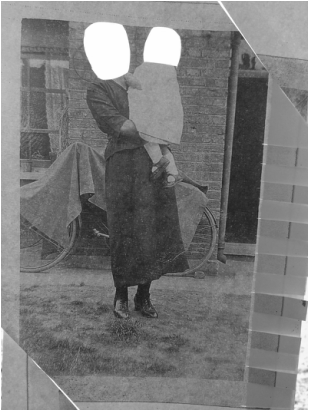
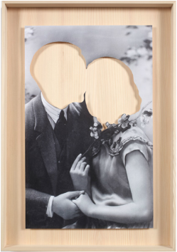
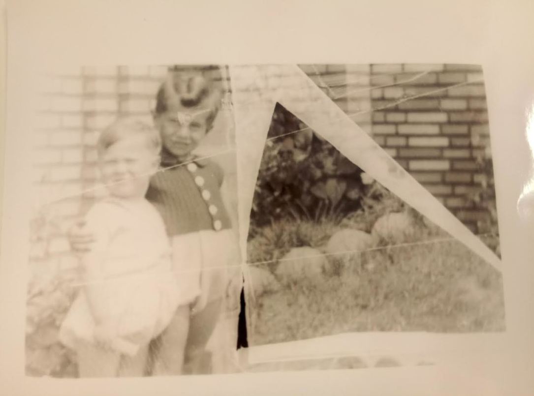
For this activity we had different pictures, a scalpel and a cutting mat. We then had to cut the pictures in whatever way we wanted to create another image. I was inspired to create this image by Hans-Peter Feldmann's work, as pictured below.
The process of creating this image.
1) I placed the image on the cutting board.
2) I used my scalpel to cut out the people's faces.
3) I used the ruler and scalpel to cut the edges off the picture then I swapped them aorund.
4) I then cut a white strip of paper.
5) I then cut strips on one side of the picture.
6) I weaved the strip of white paper in and out of the slits on the side.
7) Then, I went to the window, stuck it on the window with masking tape and stared to take pictures.
WWW: The weaved line on the side worked well becuase it makes the image look less simple becuase without it, it looked very plain and simple.
EBI: It would have been better if the lines I cut were straight because the edges don't completley match up.
This is a picture I created by weaving the strips in and out. I did this by cutting 2 images into strips then weaving them in and out of each other. It was a little time consuming but I like the out come of it.
Hans-Peter Feldmann.
A german visual artist.
Books: Album, Smoke,Voyeur,Little seagull book.
Made his 1st series of books 1968-1971. Born in Dusseldorf Germany.
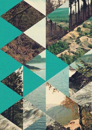
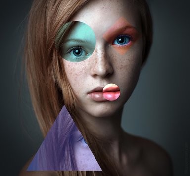
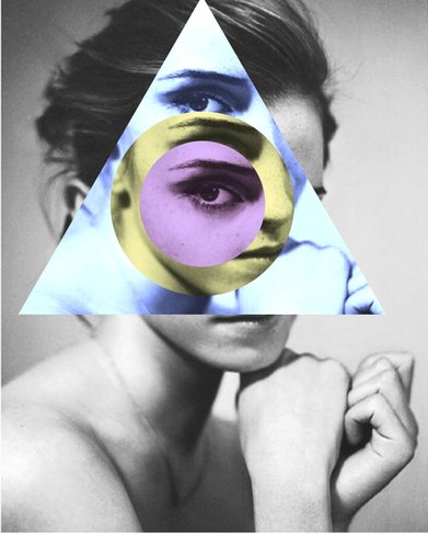
Jelle Martens.
He lives and works in Gent. He is a Belgian artist and designer known for combining photographs and collages. He works with geometric shapes that are based on the triangle shape.
Hans-Peter Feldmann.
A german visual artist.
Books: Album, Smoke,Voyeur,Little seagull book.
Made his 1st series of books 1968-1971. Born in Dusseldorf Germany.
Jelle Martens.
He lives and works in Gent. He is a Belgian artist and designer known for combining photographs and collages. He works with geometric shapes that are based on the triangle shape.
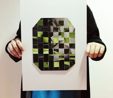
This is the 1st image I made on photoshop using the image clipper.
I don't like this image as much as the second one I made because it doesn't look as cool or interesting as the second one. If I was to do this again I would use more of one shape instead of a range of different ones.
I don't like this image as much as the second one I made because it doesn't look as cool or interesting as the second one. If I was to do this again I would use more of one shape instead of a range of different ones.
This is the second image I made on photoshop using the object clipper. I feel that this is better than the first image because I have had more practice and got used to using the software.
How to image clip on photoshop.
1. open image file
2. duplicate layer
3. click the custom shape tool.
4. choose what shape you would like.
5. Draw the shape on the image
6. On the layer bar, drag layer 1 over the shape.
7. while pressing alt ,hover between layer 1 and the shape and click the mouse pad.
8. find where you cut the shape and click the mouse. you will be able to move the shape.


In the first picture, the writing has dripped down the wall. The picture looks as though it has been burned around the edges but that could be because it is an old photo. In the bottom half of the first photo, there looks like there is a mirror leaning against the wall.
In the second picture it is very bright and colourful and the layout looks as though they have thought about it and not just put the objects anywhere. There are 2 blue objects in the image but the smaller one at the front stands out. I think that both images are still life because in the 1st image, they are using mirrors to capture the words instead of just taking the picture. normally. I think the little figure in the 1st image is unusual because the artist
has shaken him, so it looks like he is moving.
The main differences in the pictures is that the image on the left is in black and white, and the image on the right is very bright and colourful. A difference is that the black & white one is dark, gloomy and dirty where as the colourful one is clean and there isn't any dirt in the background on the backdrop. The 'sick of goodbyes' strikes me as the most interesting because you can't see what the writing is written with. In the vitturi image there is a lot of dead space in the background, but they used up a lot of space in the centre of the image.
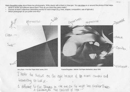
There are many different types of edges in both of the images for example in the image on the left, there are mainly just squares but in the image on the right there are curved edges, squared edges and rounded edges. The left image helps me think about the relationship between edges and photography because you can see different reflections of edges line in the bottom right hand corner, there is a shadow of a triangle which has a very pointed point. If I could ask the artists and questions I would ask the first person:
1)Was the spelling mistake deliberate?
2)Why did you decide to use the mirrors?
3)If you were to do this again, would you change anything?
I would ask the second artist:
1)Why did you balance all the objects on a brick?
2)How come you only chose 3 different colours?
3)Why did you call it "Red1"?
4)Did you use glue or wire to keep everything in place?
If I could give the images another title I would call the first image "goodbyes" because it looks like gloomy, dingy and sad just like goodbyes can be. I would call the 2nd image "colour land" because it is full of colour and it attracts people to come and look at it. I think the artist made the first image because he might wish that every time he had to leave people he didn't have to always say goodbye but maybe something else. For the second image, I think the artist made it because he might enjoy painting things with colour. I think the first image is about the artist, Robert Frank, being sick of people leaving him, either through death or going and not coming back. I think the second image is about the artists' favourite things.


This is a concertina book I made to show my edges pictures. They are also called accordion books. There are many different ways to make them but I went with the easiest way. I made a collage on photoshop then I printed it out. After that, I cut three lines and folded it to make the book. It was a little tricky at first, but after a few attempts I got it right.


HOMEWORK. Take at least 30 photos of edges.


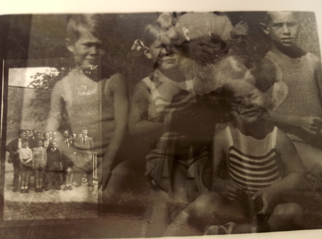
All 6 of these images above are by J Frede. I like his images because he combines different images to make one. It is interesting because the pictures aren't always the same colour so they pop even more. It helps me to think about edges because with J Frede you have to look at the edges and match them up.

This is my favourite one because he has used a mixture of old and new pictures. The one in the middle looks the oldest, and the picture on the right looks the newest.
In the first image, it looks as though the picture was taken from the inside of a car. The second image looks like it was taken from the top of a building looking down on the city/town. The last image looks as though it was taken high up in the air because you can see a vast amount of the area. If I could name this work, I would call it new vintage because it has old and new images.
In the first image, it looks as though the picture was taken from the inside of a car. The second image looks like it was taken from the top of a building looking down on the city/town. The last image looks as though it was taken high up in the air because you can see a vast amount of the area. If I could name this work, I would call it new vintage because it has old and new images.


This is my photography exhibition I had to create for homework. I decided to put the pictures I had printed on the fence in my back garden. I chose my Mum, Dad and sister to come and see my exhibition.
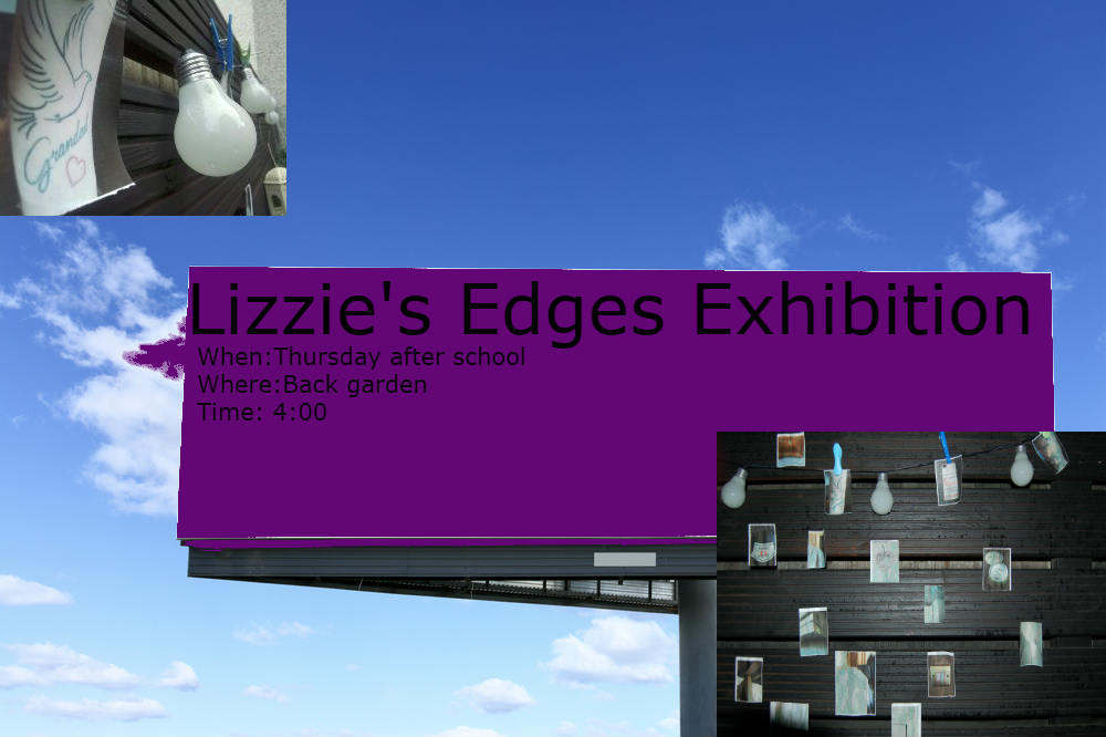
This is my poster for my edges exhibition. To create it I used photoshop. I thought a digitally made poster would be better as it would look more professional than a hand made poster.


This is my fanzine that I made in class. I used different pictures, stickers and tape. I chose 3 different pictures for the inside then picked some more for the outside. I folded and cut one of the images I had. Also, on the back I taped 3 pictures


I made this image with Emilia on photoshop.
I liked making this photo because I got to play around with the different colour tones and being able to make the stairs pop out.
I liked making this photo because I got to play around with the different colour tones and being able to make the stairs pop out.
How I made this picture.
1. I cut up two different negatives.
2. I stuck them together in an unusual way.
3. I took it into the dark room.
4. I put the negative into the enlarger.
5. I made sure it was in focus.
6. I then exposed the paper for 9 seconds.
7. I took the paper over to the chemicals.
8. I left the paper in the developer for 1 minute.
9. I put it into the stop fix.
10. I put it into the water to get rid of excess chemicals.
11. I let it dry.
MY FINAL OUTCOME.
I decided to enlarge a negative because I thought it would look interesting. Especially as I added another negative over the paper so you would see that as well.
I think my final outcome is effective because it looks different to everyone else and no one is going to have the exact same image as me. I enjoyed doing this because I liked seeing how different times affected the way the image came out. I created this image twice. The first time I exposed it for 5 seconds and it didn't come out the way I wanted. The second time I exposed it for 9 seconds and the result was the is image. I preferred this image because you can see the second negative in the bottom left hand corner more. I have used the following Habits of Mind in creating my final outcome: Disciplined-crafting and improving & Inquisitive- Exploring and investigating.
If I had more time, I would add another negative over the top. This will improve my outcome because it would make it look even more interesting and unique. I realise that I could have refined my project a bit more. For example, I could have uploaded it to photoshop and edited it on there. The Habit of Mind I need to strengthen more is Imaginative- Playing with possibilities.
